
Showing posts with label OUGD303 DP. Show all posts
Showing posts with label OUGD303 DP. Show all posts
Tuesday, 29 May 2012

Monday, 28 May 2012
Final Products: UPDATE
Today I was informed by Samantha that she required ALL the deliverables I had created for her branding. This put me in a little bit of a blind panic. She has a deadline of 3pm tomorrow. I have no print sessions left. If I had known this was the case a few weeks ago I would have organised it to give myself a little more time to create duplicates for myself.
Unfortunately this means I will not be submitting any physical products for the brief. I will try to get as many good product shots as I can before the products are taken off my hands at 3pm tomorrow. But I am slightly worried that without physical objects, you will not be able to gauge the effort an care that was put into assembling them. Nor will the stick choices be evident. Ugh, fashion. Just another reason to add to the long list of reasons why I have not enjoyed this brief.
Unfortunately this means I will not be submitting any physical products for the brief. I will try to get as many good product shots as I can before the products are taken off my hands at 3pm tomorrow. But I am slightly worried that without physical objects, you will not be able to gauge the effort an care that was put into assembling them. Nor will the stick choices be evident. Ugh, fashion. Just another reason to add to the long list of reasons why I have not enjoyed this brief.
Sunday, 27 May 2012
Printed & Assembled Packaging Items
Today I was able to print and assemble the exterior packaging for Samanatha's collection. This included a double sided print for the bag, and a double sided print for the box found inside the bag.
The bag itself is printed on one sided 300 gsm silver stock. The logo is featured on just one side. Black eyelets have been used to hold the 5mm black rope for the handles. Inside the bag is a repeated pattern of a white tryptik triangle on a black background. I was initially unable to print double sided on the stock as the silver side did not absorb the ink. I had to wait a while, actually a whole day, for it to dry and then feed it back through to achieve the desired effect. Even though this was a little frustrating, I was very pleased with the final results, and if needed would do the same thing again.


Inside the silver bag is a constructed black box, complete with printed tracing paper for extra padding. The box itself is incredibly simple in design, but this is what Samantha requested so I was left no other option than adhering to her requirements. I tried to bring a little something extra to the product by having a a repeated pattern placed on the bottom of the bottom part, and a single triangle on the inside of the top part.

Below is an image of what the box looks like within the bag. The fit is quite snug, but due to the large nature of Samantha's garments and the printing restrictions I was faced with I could only do my best.

The bag itself is printed on one sided 300 gsm silver stock. The logo is featured on just one side. Black eyelets have been used to hold the 5mm black rope for the handles. Inside the bag is a repeated pattern of a white tryptik triangle on a black background. I was initially unable to print double sided on the stock as the silver side did not absorb the ink. I had to wait a while, actually a whole day, for it to dry and then feed it back through to achieve the desired effect. Even though this was a little frustrating, I was very pleased with the final results, and if needed would do the same thing again.


Inside the silver bag is a constructed black box, complete with printed tracing paper for extra padding. The box itself is incredibly simple in design, but this is what Samantha requested so I was left no other option than adhering to her requirements. I tried to bring a little something extra to the product by having a a repeated pattern placed on the bottom of the bottom part, and a single triangle on the inside of the top part.
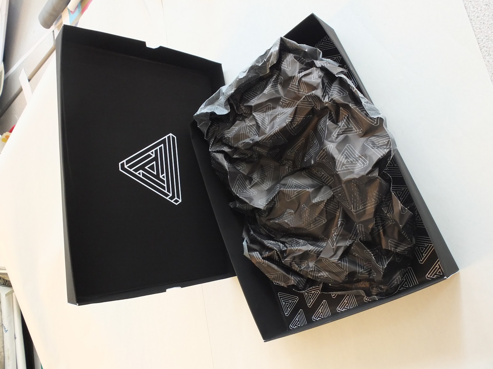
Below is an image of what the box looks like within the bag. The fit is quite snug, but due to the large nature of Samantha's garments and the printing restrictions I was faced with I could only do my best.

Final Product Shots
Today I managed to complete my fashion branding brief. It was a real struggle to work to my schedule when Samantha had been given an extension. She was working towards dates that meant I had very little time to bring together resolutions and have them printed on the right stock and to the right format.
Below is a shot of the business cards. Having designed the logo quite a while ago this was a part of her stationery that I was able to stay on stop of. It took a lot for me to receive her approval. Let's just say she wasn't scared to make her opinions known. I advised that a triangular business card was perhaps not the best option, but she insisted. Nevertheless I am pleased with results, and think this unique approach sets her apart from the rest of her graduating year. Something she wanted more than anything.

Another deliverable I was able to complete today was the triangular look book. After being given the images only a few days ago, I was left just a few days to develop a design that was both practical and satisfied her quirky requirements. The book itself was printed in three X3 sections, resulting in a 46 page publication, with additional front and reverse covers. I bound the publication with a coptic stitch, and then covered the seam with a strip of black cotton Samantha had used in her collection.
Below are a few product shots that show the book layout in action. It took a while to figure out how the images and text would be printed correctly, but I was incredibly proud when it all came together with no complications.


Below is a shot of the business cards. Having designed the logo quite a while ago this was a part of her stationery that I was able to stay on stop of. It took a lot for me to receive her approval. Let's just say she wasn't scared to make her opinions known. I advised that a triangular business card was perhaps not the best option, but she insisted. Nevertheless I am pleased with results, and think this unique approach sets her apart from the rest of her graduating year. Something she wanted more than anything.

Another deliverable I was able to complete today was the triangular look book. After being given the images only a few days ago, I was left just a few days to develop a design that was both practical and satisfied her quirky requirements. The book itself was printed in three X3 sections, resulting in a 46 page publication, with additional front and reverse covers. I bound the publication with a coptic stitch, and then covered the seam with a strip of black cotton Samantha had used in her collection.
Below are a few product shots that show the book layout in action. It took a while to figure out how the images and text would be printed correctly, but I was incredibly proud when it all came together with no complications.


Thursday, 24 May 2012
Final Sin Inspired Patterns
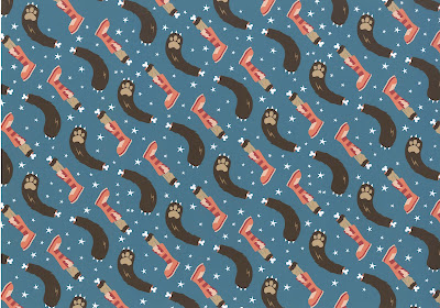
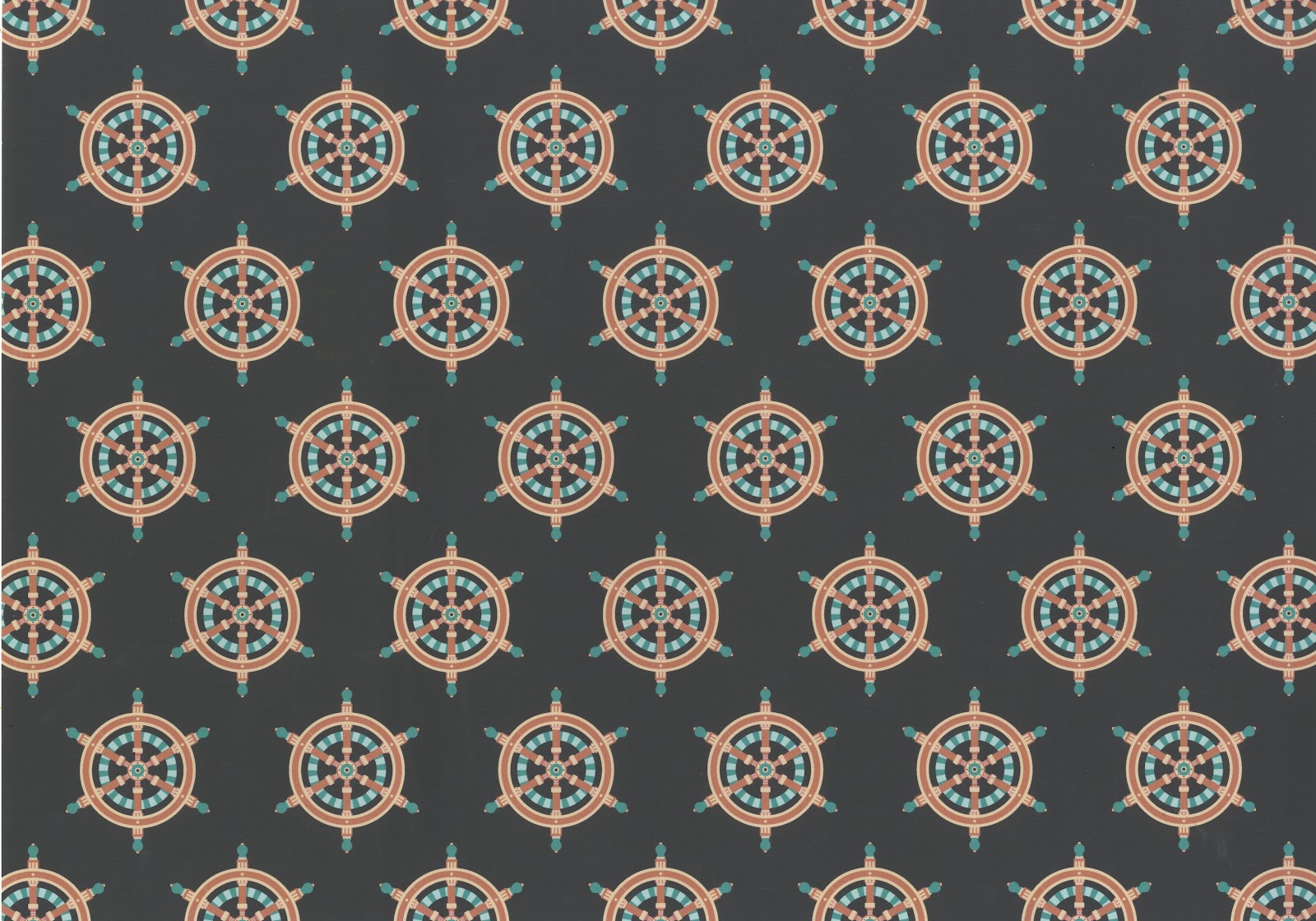
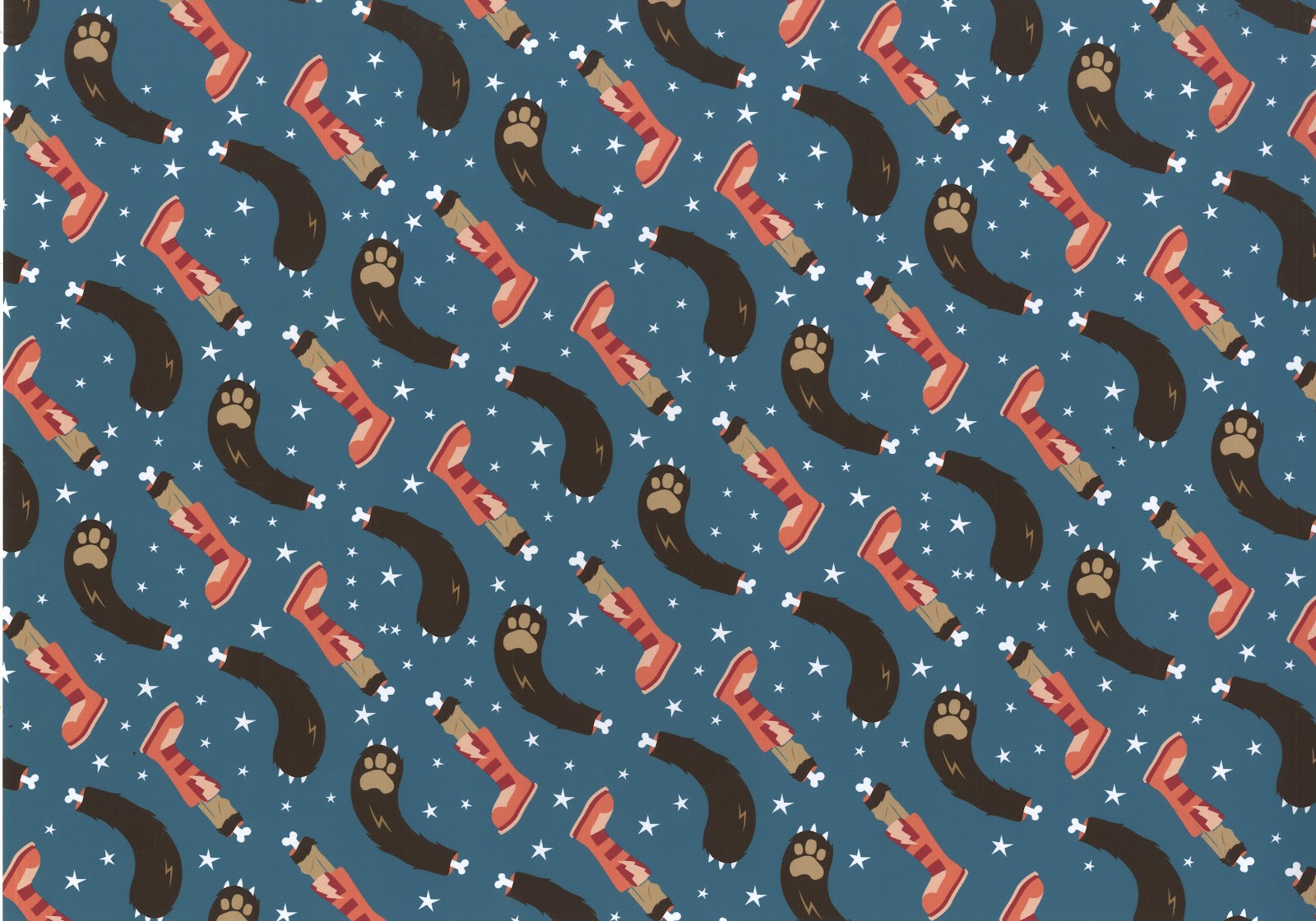
Below are the final seven patterns I have generated for this brief. Each one takes the 'punishment in hell' for the seven sins, and the animal that represents it, and interprets it in my own way. The list goes as follows from top to bottom:
Broken on the wheel (Pride)
Snake frozen in water (Envy)
Toad boiled alive in oil (Greed)
Smothered in fire and brimstone (Lust)
Dismembered alive (Wrath)
Snail thrown in snake pit (Sloth)
Force fed snakes (Gluttony)
I'm incredibly happy with the results, and think the patterns work really well both together and individually. I am also very pleased with the colour combinations I was able to come up with.




Broken on the wheel (Pride)
Snake frozen in water (Envy)
Toad boiled alive in oil (Greed)
Smothered in fire and brimstone (Lust)
Dismembered alive (Wrath)
Snail thrown in snake pit (Sloth)
Force fed snakes (Gluttony)
I'm incredibly happy with the results, and think the patterns work really well both together and individually. I am also very pleased with the colour combinations I was able to come up with.




Assembled Swing Tags
Another day, another assmebled resolution to my fashion branding brief. Today I was able to print and assemble the swing tags for the 'Tryptik' collection. I was incredibly pleased with the results. I think the reason for my satisfaction with the swing tags is how nicely all the different elements came together.
The tags themselves are composed of three different elements. Firstly is a 40mm wide piece of mirror with the tryptik triangle ecthed onto one side. Next is piece of tracing with the triangle printed on in black ink, laid over the greyscale diamond patter. On the reverse of this pattern is all the necessary information for the individual garments. These two stocks are held together with a stainless steel 5mm eyelet.
The last component of the swing tags is another triangle, this time printed using the single silver sided stock. On the white side is the inspiration behind the collection. This tag is finished off with a 5mm matte black eyelet, chosen to contrast the silver stock. All the different elements are brought together with a 3mm stainless steel chain measuring roughly 200mm, allowing a 100mm drop length.
I think the tags work really well because of the many different ways the logo is featured; printed on different stock in different colours, and even etched into mirror. Samantha was incredibly pleased, and so was I!


The tags themselves are composed of three different elements. Firstly is a 40mm wide piece of mirror with the tryptik triangle ecthed onto one side. Next is piece of tracing with the triangle printed on in black ink, laid over the greyscale diamond patter. On the reverse of this pattern is all the necessary information for the individual garments. These two stocks are held together with a stainless steel 5mm eyelet.
The last component of the swing tags is another triangle, this time printed using the single silver sided stock. On the white side is the inspiration behind the collection. This tag is finished off with a 5mm matte black eyelet, chosen to contrast the silver stock. All the different elements are brought together with a 3mm stainless steel chain measuring roughly 200mm, allowing a 100mm drop length.
I think the tags work really well because of the many different ways the logo is featured; printed on different stock in different colours, and even etched into mirror. Samantha was incredibly pleased, and so was I!


Wednesday, 23 May 2012


Look Book Double Page Spreads
After getting the go ahead from Samantha I was able to press forward with the look book layout.She approved of an image being used on the right hand side page, and all the corresponding information on the left. She also liked the fact that I used the diagonal spine of the book as alignment for the text. This was something I then went on further to explore, before ultimately settling on the designs seen below. Also below you an see how I dealt with laying out the text heavy pages, and how I incorporated the greyscale pattern I designed.
She wanted a way of using the logo on each page and if possible having page numbers. So I settled on the approach shown below on the artwork. It's a reflection of the way the pages themselves are laid out.


She wanted a way of using the logo on each page and if possible having page numbers. So I settled on the approach shown below on the artwork. It's a reflection of the way the pages themselves are laid out.
Tuesday, 22 May 2012
Look Book Development
Today I started working on the layout for the look book. I knew I'd be working with a triangle so I wanted to get on with it, and establish any potential issues early on. Luckily I wasn't faced with that many issues, I was even pleasently surprised with the range of layouts I was able to generate for such awkward dimensions. Below are a few screens shots and flip books showing how I got from one stage at the beginning to ideas that I intend to take further once I have Samantha's approval.




Monday, 21 May 2012


Friday, 18 May 2012
Thursday, 17 May 2012


Subscribe to:
Posts (Atom)