This module had proved to be the most difficult module to date, though that was always going to be the case. I have learnt both positive and negative things about myself, and my design practice, throughout the duration of the module. It has been an eye opening experience, and though at times it may have been overwhelming, I think I leave the course with a clearer idea as to what my design future entails.
A positive taken from this module is the discovery that I am fully capable of producing high quality, visually engaging design using a range of different illustration techniques. Though illustration has always been part of my previous modules, it has never been the sole focus. With this module I took it upon myself to work with a range of illustrative approaches as a creative challenge. I consider myself to have succeeded in several areas, and confirmed to others and myself that I am a visually driven designer. If people where to see me as an illustrator, I would have no problem with that.
Collaborative briefs, such as the DFGA yearbook and the fashion branding, have shown me that I am not a natural leader. I have struggled when it comes to organising people and setting personal deadlines. I always knew it wasn’t in my nature to take charge of situations, and this module has reaffirmed that theory in my mind. However, this is not to say that I am incapable of expressing my opinions when necessary. During DFGA meetings I presented my design work with conviction and clarity, something which I feel aided Mike in choosing my page layouts to develop further. I also made it clear to my fashion student certain ideas she had envisioned in her mind simply would not work for her branding, and instead we came to creative compromises. I have most definitely learnt the hard way that working with a client is a challenge, both mentally and creatively. It’s not something I wish to do again any time soon.
If I where to do the module again there are certain things I would do differently. I may say this at the end of every module, but I should have blogged more. At points I was completely on top of my blog posts, each one with appropriate imagery and thorough supporting analysis. Yet there where also moments when I let it build up, almost to the point where it was difficult to get back on track. This is something I regret now. I would also have picked my briefs a lot earlier, and exploit to their full potential rather than waiting for each to develop at it’s own pace leaving me with few options due to time constraints. Time management has been a big issue for me. Unable to work on more than one brief at a time I should have been organised and assigned weeklong deadlines, and stuck to them. But I just didn’t.
I come out of this final module with a skewed outlook as to what the future holds. At times I have felt graphic design is the only career path I can take. At others it has felt like I have no place within the industry. It would be hard for me to evaluate my time during this module without sounding negative, perhaps even cynical. With additional personal issues to deal with, graphic design should have taken precedence; it should have been an outlet for me. But it wasn’t. It became something I avoided because I couldn’t handle the fact I wasn’t achieving the level of professionalism I assumed I would so late on the course. More than anything I have come to the conclusion that making ‘pretty pictures’ isn’t enough, yet it seems this is all I am capable of. I’m not entirely sure what the future holds for me, but if it involves some sort of illustration then I would be more than happy.

Showing posts with label Brief 03: Skate Company. Show all posts
Showing posts with label Brief 03: Skate Company. Show all posts
Tuesday, 29 May 2012

Evaluation: Los Pecados
What started as a brief a long, long time ago I was determined to work at the best of my creative abilities to come up with resolutions. I knew from the outset it wad a generic idea for a brief. I think that's why I set myself the challenge though, I wanted to prove to myself and others that I had the ability to take something that many others have attempted and bring a personal approach to it.
It started as a type driven brief, trying to come up with a logo design. This was an aspect of the brief that I was not expecting to enjoy as much as I did. Branding is something I have never attempted before, often skipping that step, or designing an incredibly simple logo to apply to my products, but with brief I forced myself to work on a logo design, and I believe it paid off.
The logo itself was in part influenced by illustrations I was working on for the 'Splendor Pelicula' brief. I would lying if I said that the briefs didn't start to blend into one at one point. However I brought myself out of that situation by actively working with a different illustrative approach for the rest of the brief. I really wanted to challenge how I worked with illustrator to creating bold and enticing visuals that stood alone. I started with an initial bear illustration to represent the 'wrath' sin, and received positive feedback from pretty much everyone. This was a positive, but a negative in many ways as well.
It proved to myself that I could create light hearted and humourous illustrations that communicated what I intended. However this turned out to be a curse, as it meant I got lazy and assumed I could create illustrations of the same standard for the rest of the 'sins'. I couldn't. I stepped away from the brief for a while to work on other stuff, but quickly realised once I had detached myself from this illustrative approach it was hard to get back into. I struggled to create visuals for the rest of the brief requirements, and in conclusion I was actually disappointed with what I created.
This brief was most definitely the one brief that enforced the fact that I am not the best multi tasker. I find it very difficult to work on two or more things at once, and even more difficult to re-approach a brief once I have been away from it for so long. I wouldn't say I am disappointed with my final visuals, because I do think they represent my use of colour and illustrations very well, I just think that I could have applied the patterns to a wider range of products and thought about the context of the patterns a lot more.
It started as a type driven brief, trying to come up with a logo design. This was an aspect of the brief that I was not expecting to enjoy as much as I did. Branding is something I have never attempted before, often skipping that step, or designing an incredibly simple logo to apply to my products, but with brief I forced myself to work on a logo design, and I believe it paid off.
The logo itself was in part influenced by illustrations I was working on for the 'Splendor Pelicula' brief. I would lying if I said that the briefs didn't start to blend into one at one point. However I brought myself out of that situation by actively working with a different illustrative approach for the rest of the brief. I really wanted to challenge how I worked with illustrator to creating bold and enticing visuals that stood alone. I started with an initial bear illustration to represent the 'wrath' sin, and received positive feedback from pretty much everyone. This was a positive, but a negative in many ways as well.
It proved to myself that I could create light hearted and humourous illustrations that communicated what I intended. However this turned out to be a curse, as it meant I got lazy and assumed I could create illustrations of the same standard for the rest of the 'sins'. I couldn't. I stepped away from the brief for a while to work on other stuff, but quickly realised once I had detached myself from this illustrative approach it was hard to get back into. I struggled to create visuals for the rest of the brief requirements, and in conclusion I was actually disappointed with what I created.
This brief was most definitely the one brief that enforced the fact that I am not the best multi tasker. I find it very difficult to work on two or more things at once, and even more difficult to re-approach a brief once I have been away from it for so long. I wouldn't say I am disappointed with my final visuals, because I do think they represent my use of colour and illustrations very well, I just think that I could have applied the patterns to a wider range of products and thought about the context of the patterns a lot more.
Thursday, 24 May 2012
Final Sin Inspired Patterns
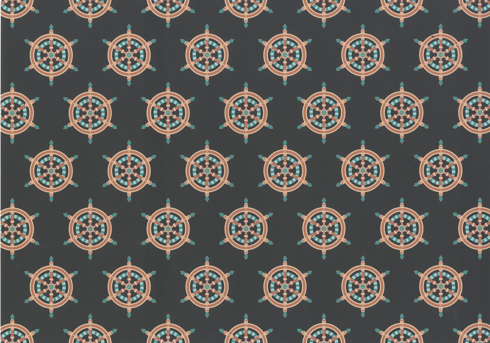
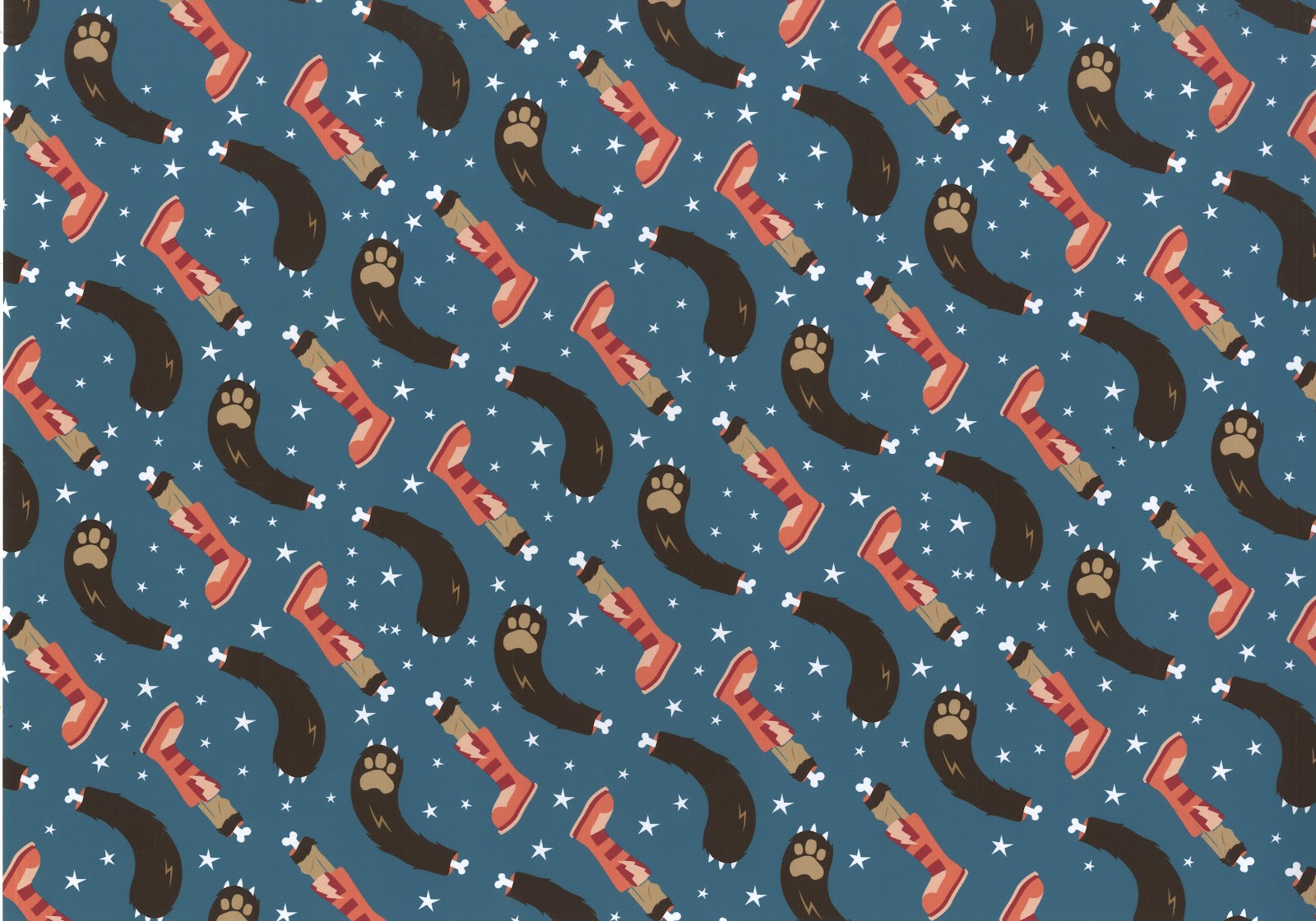
Below are the final seven patterns I have generated for this brief. Each one takes the 'punishment in hell' for the seven sins, and the animal that represents it, and interprets it in my own way. The list goes as follows from top to bottom:
Broken on the wheel (Pride)
Snake frozen in water (Envy)
Toad boiled alive in oil (Greed)
Smothered in fire and brimstone (Lust)
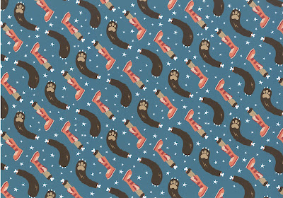
Dismembered alive (Wrath)
Snail thrown in snake pit (Sloth)
Force fed snakes (Gluttony)
I'm incredibly happy with the results, and think the patterns work really well both together and individually. I am also very pleased with the colour combinations I was able to come up with.




Broken on the wheel (Pride)
Snake frozen in water (Envy)
Toad boiled alive in oil (Greed)
Smothered in fire and brimstone (Lust)
Dismembered alive (Wrath)
Snail thrown in snake pit (Sloth)
Force fed snakes (Gluttony)
I'm incredibly happy with the results, and think the patterns work really well both together and individually. I am also very pleased with the colour combinations I was able to come up with.




Monday, 21 May 2012


Tuesday, 1 May 2012
Final Sin Illustrations
It took quite an extensive amount of time to finalise my seven illustrations for my skate branding brief, something I had not anticipated. It was important that there was a sense of continuity across the range, yet they were different enough, and strong enough, to stand alone. There are still a few things I want to change, such as the colour schemes on select illustrations. Certain ones definitely wok better than others... something I will most definitely have to address. However it is nice to know that I now have the basis for the brief, and what with the logo design finalized and tags and packaging ideas generating in my head, I feel I am making headway with it. I just need to stop focusing on my first Film Zine brief and start to prioritise other ones, or I will lose my way and end up with one fully realised project and several other, much weaker, ones. This is a brief I feel I can definitely impress with, and make some brilliant resolutions, I just need to be a lot more driven at this moment in time.
Thursday, 15 March 2012
Logo Application
Just a few screencaps of my development in regards to swing tag designs. I have a lot further to go!


Tuesday, 13 March 2012
Heydays
Just a few inspiration shots for my skate company stationery. Knowing the products will be colourful and not visually subtle, packing quite a punch, I think it's important the company itself has a simple and stylish logo, accompanied by appropriate stationery.


Finalising Skate Logo
I think I have finally settled on a logo design for my skate company 'Pecados'. It took several attempts to create an effective design that was both visually impacting and held a greater meaning. I settled on working primarily with black and white stroked artwork. This may be a slight overlap from my other briefs, but knowing the remainder of the artwork I create for the skate brief will be bold and colourful, I felt it necessary for the logo to be simple. I like the shape of the logo, and how all the separate components are brought together through a banner and an almost crest like illustration. I'm not sure if my intended message is communicated, bu the circular design at the top of the composition is supposed to be a skate wheel. Hopefully when the design is in context it will become more apparent.

Below is a flip book documenting the different stages of my logo development. It's a bit jumpy, but the general idea is there.
Thursday, 8 March 2012
Los Pecados: Final Logo
After playing around with compositions for the skate company logo and experimenting with illustration for the clothing range I realised something. Because the illustrations will be intricate and incredibly colorful, it's most appropriate if the logo is simple and effective, and just black and white. I think I will use the circular design shown below, however there is still plenty of adjustments that need to take place. The placement of the 'los' and the 'est. 78' could do with some work, and I'm still not entirely convinced by the horizontal lines at the top end of my typeface. Nevertheless, the below image shows a rough outline of what the company logo will look like and hopefully how it will begin to appear on stationery items.


Thursday, 1 March 2012
Mocking Up
One of my biggest weaknesses has always been putting my designs into the appropriate context, constantly leaving it until the last possible moment to bring a sense of realism to my briefs. So in order to resolve this particular brief to its fullest level of professionalism I have decided to start mocking up product shots as soon as possible. Below are a few screen shots of possible compositions for iPhone cases. I have also started to arrange my designs so they can be applied to T-shirts, bags, skate decks, posters and much more. I will need to continue to brainstorm products if this brief is to be finished to the standard I have set myself.


Below are just a few quick examples of other ways of contextualising my designs.

Wednesday, 29 February 2012
Final Bear Illustration
At the beginning of today I had a rough idea of the style of illustration I would be working with for my skate branding brief. By the end of the day I had created a (hopefully) finished design that will contribute to my range of even sins skate branding. The actual illustration itself combines several aspects of research I have discovered. It blends: the colour that is used to represent the sin of wrath, also known as 'ira', the animal embodiment and also the appropriate punishment in hell, in this case being dismembered alive. Obviously this concept seems gruesome, so it is important that my illustrations are playful and humorous rather than dark and depressing.
From my initial illustration I have also managed to create a pattern that can be used as a secondary focus. It is a repeated pattern that combines the dismembered legs, arms and stars. Hopefully it is still light hearted and doesn't look too out of place without the original image.


For experimental purposes I also added a texture to the illustration and moved it slightly to the right. I think this brings a sense of texture to an otherwise flat piece of work, and is definitely something I will consider for my range of high spec deliverables. Below is a close up screen shot of the texture in question.

Bear Illustration: Wrath
Below are screen shots of development in regards to my bear illustration. Without a short back story the below illustration may seem slightly out of place and as if it has appeared from nowhere. However, I believe I have the appropriate justification. For my skate company branding brief I have decided to combine it with a subject matter that is apparently unoriginal and uninspired; the Seven Deadly Sins. Nevertheless I am determined to bring a fresh and exciting approach to a stale subject. I have decided to be playful and am prepared to work outside of my usual comfort zone. For this brief I have decided I want to develop my drawing skills and have therefore set myself the challenge of interpreting the sins in what I consider to be a unique fashion. I want to work primarily with character designs, and therefore have begun to brainstorm possibilities. For the sin known as 'Ira' in Latin, and wrath in English, I will be creating a mexican wrestler bear. This combines the animal representation of the sin and a sense of anger. Hopefully my turnaround will be quick and I can create a different illustration each day, meaning I will have the majority of my resolved visuals within a week.


Tuesday, 28 February 2012
Bear Inspiration
Before I can even begin to think about illustrating, I need some inspiration. Below is a flip book displaying a whole host of different approaches to drawing a bear character. Some are more appropriate than others, and some will end up not relating to my own illustration whatsoever. Nevertheless I need a broad starting point if I am to be successful with my own drawings.
Sin Poster Series
Another example of sin inspired design can be seen below. Rather than turning the sins into a series of characters, this designer has used a continuous focal point; the lips, and combined it with a range of exterior illustrative components.


Seven Sins Illustration
Though the illustrations below will be in no way similar to my own, they do serve as an interesting approach to character design and the way in which the seven sins can be interpreted. However I am a fan of the below drawings and think I will use a similar approach of documenting key characteristics that personify the sinful attributes.


Subscribe to:
Posts (Atom)