This module had proved to be the most difficult module to date, though that was always going to be the case. I have learnt both positive and negative things about myself, and my design practice, throughout the duration of the module. It has been an eye opening experience, and though at times it may have been overwhelming, I think I leave the course with a clearer idea as to what my design future entails.
A positive taken from this module is the discovery that I am fully capable of producing high quality, visually engaging design using a range of different illustration techniques. Though illustration has always been part of my previous modules, it has never been the sole focus. With this module I took it upon myself to work with a range of illustrative approaches as a creative challenge. I consider myself to have succeeded in several areas, and confirmed to others and myself that I am a visually driven designer. If people where to see me as an illustrator, I would have no problem with that.
Collaborative briefs, such as the DFGA yearbook and the fashion branding, have shown me that I am not a natural leader. I have struggled when it comes to organising people and setting personal deadlines. I always knew it wasn’t in my nature to take charge of situations, and this module has reaffirmed that theory in my mind. However, this is not to say that I am incapable of expressing my opinions when necessary. During DFGA meetings I presented my design work with conviction and clarity, something which I feel aided Mike in choosing my page layouts to develop further. I also made it clear to my fashion student certain ideas she had envisioned in her mind simply would not work for her branding, and instead we came to creative compromises. I have most definitely learnt the hard way that working with a client is a challenge, both mentally and creatively. It’s not something I wish to do again any time soon.
If I where to do the module again there are certain things I would do differently. I may say this at the end of every module, but I should have blogged more. At points I was completely on top of my blog posts, each one with appropriate imagery and thorough supporting analysis. Yet there where also moments when I let it build up, almost to the point where it was difficult to get back on track. This is something I regret now. I would also have picked my briefs a lot earlier, and exploit to their full potential rather than waiting for each to develop at it’s own pace leaving me with few options due to time constraints. Time management has been a big issue for me. Unable to work on more than one brief at a time I should have been organised and assigned weeklong deadlines, and stuck to them. But I just didn’t.
I come out of this final module with a skewed outlook as to what the future holds. At times I have felt graphic design is the only career path I can take. At others it has felt like I have no place within the industry. It would be hard for me to evaluate my time during this module without sounding negative, perhaps even cynical. With additional personal issues to deal with, graphic design should have taken precedence; it should have been an outlet for me. But it wasn’t. It became something I avoided because I couldn’t handle the fact I wasn’t achieving the level of professionalism I assumed I would so late on the course. More than anything I have come to the conclusion that making ‘pretty pictures’ isn’t enough, yet it seems this is all I am capable of. I’m not entirely sure what the future holds for me, but if it involves some sort of illustration then I would be more than happy.

Showing posts with label Brief 01: Film Zine. Show all posts
Showing posts with label Brief 01: Film Zine. Show all posts
Tuesday, 29 May 2012

Evaluation: Splendor Pelicula
This brief has been the most enjoyable, perhaps even the most engaging. However due to this I may have neglected others, and spent far too much time working on designs and finalising artwork rather than settling on an initial design I feel happy with and moving on.
Due to the subject matter of the brief appealing so much to me on a personal level I found myself drawn to the informative aspect of the brief. I think all I have wanted to do with any of my film related briefs before is educate an audience. I realise I am supposedly a graphic designer, and therefore design should always be at the top of my priority list, but unfortunately this turns out not to be the case more often than not. I get distracted by the information I am communicating to an audience, and because it's stuff I already know as an avid film fan, I forget I may be talking to an audience who is not on the same wavelength as me.
However I think I acknowledged this at an early point during this brief, and then continued to generate design ideas that where appropriate for a range of audiences.
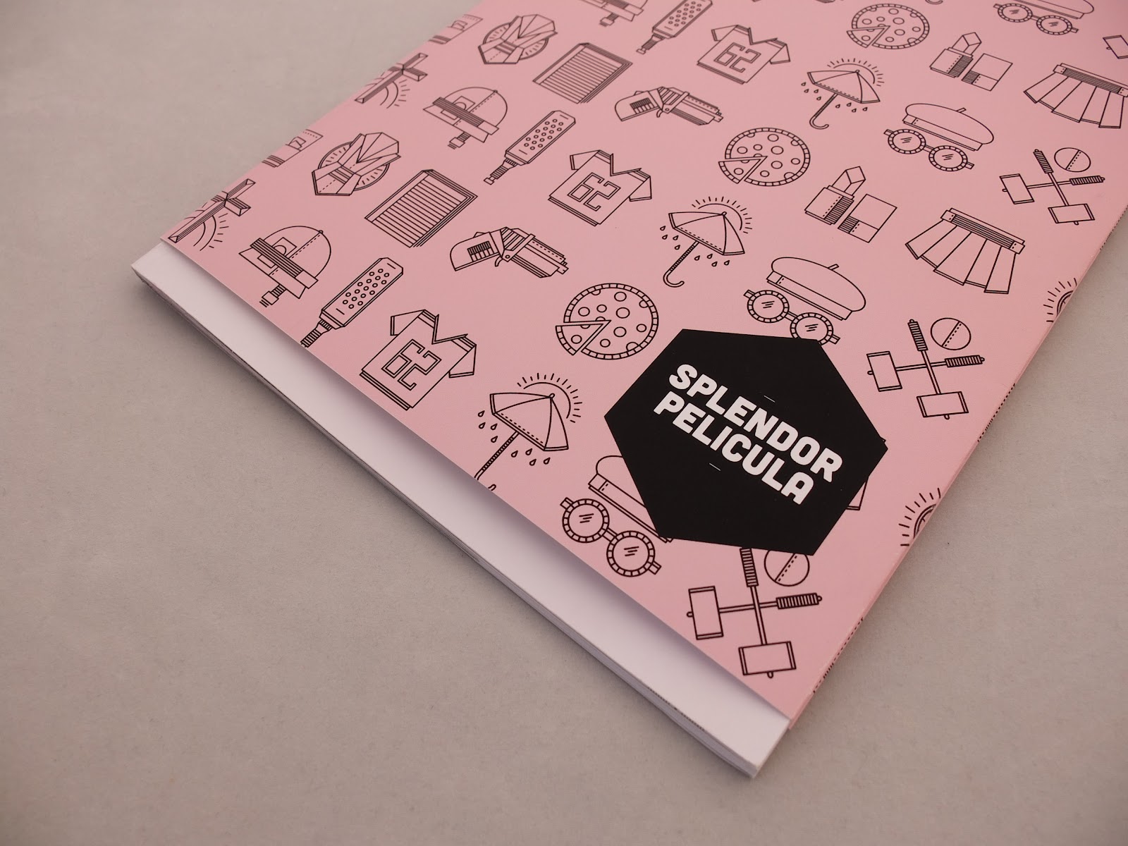
Another reason why this brief has become my most well rounded, accomplished brief is the fact that I was given the opportunity to explore a different illustrative approach. I have never worked with solely line drawings before, especially such a vast amount of them. I really enjoyed making the icons, and think it is definitely a visual style I will explore further in the future and perhaps even incorporate into my branding and promotional work. It was an extreme design challenge, and at times I found myself at a loss as to what object I could use to represent each film. I will also admit that some are a lot less successful than others, but when all are brought together I think they work really well.
Another aspect of the brief that really caught my attention was the potential for colour usage. I liked the way I used just the one colour for each genre of film I tackled, as this is something I have never done before. I pride myself on my colour combinations, and think I am fairly adept at bringing two or three colours together that compliment each other perfectly. However with this brief I did not allow myself that option and forced myself to exploit a single colour as much as I could.
In conclusion I think this brief has been the most rewarding in regards to helping me realise what subject matter I want to work with in the future, and the editorial limits I am willing to push myself to. It may be a little naive of me to re-iterate the fact that I do not wish to work with anything other than film or TV in the future. But I am willing to make such a statement if it means I retain pride for my work.
Due to the subject matter of the brief appealing so much to me on a personal level I found myself drawn to the informative aspect of the brief. I think all I have wanted to do with any of my film related briefs before is educate an audience. I realise I am supposedly a graphic designer, and therefore design should always be at the top of my priority list, but unfortunately this turns out not to be the case more often than not. I get distracted by the information I am communicating to an audience, and because it's stuff I already know as an avid film fan, I forget I may be talking to an audience who is not on the same wavelength as me.
However I think I acknowledged this at an early point during this brief, and then continued to generate design ideas that where appropriate for a range of audiences.
Another reason why this brief has become my most well rounded, accomplished brief is the fact that I was given the opportunity to explore a different illustrative approach. I have never worked with solely line drawings before, especially such a vast amount of them. I really enjoyed making the icons, and think it is definitely a visual style I will explore further in the future and perhaps even incorporate into my branding and promotional work. It was an extreme design challenge, and at times I found myself at a loss as to what object I could use to represent each film. I will also admit that some are a lot less successful than others, but when all are brought together I think they work really well.
Another aspect of the brief that really caught my attention was the potential for colour usage. I liked the way I used just the one colour for each genre of film I tackled, as this is something I have never done before. I pride myself on my colour combinations, and think I am fairly adept at bringing two or three colours together that compliment each other perfectly. However with this brief I did not allow myself that option and forced myself to exploit a single colour as much as I could.
In conclusion I think this brief has been the most rewarding in regards to helping me realise what subject matter I want to work with in the future, and the editorial limits I am willing to push myself to. It may be a little naive of me to re-iterate the fact that I do not wish to work with anything other than film or TV in the future. But I am willing to make such a statement if it means I retain pride for my work.
Tuesday, 22 May 2012


Thursday, 3 May 2012
Final Web Pages: Comedy Collection
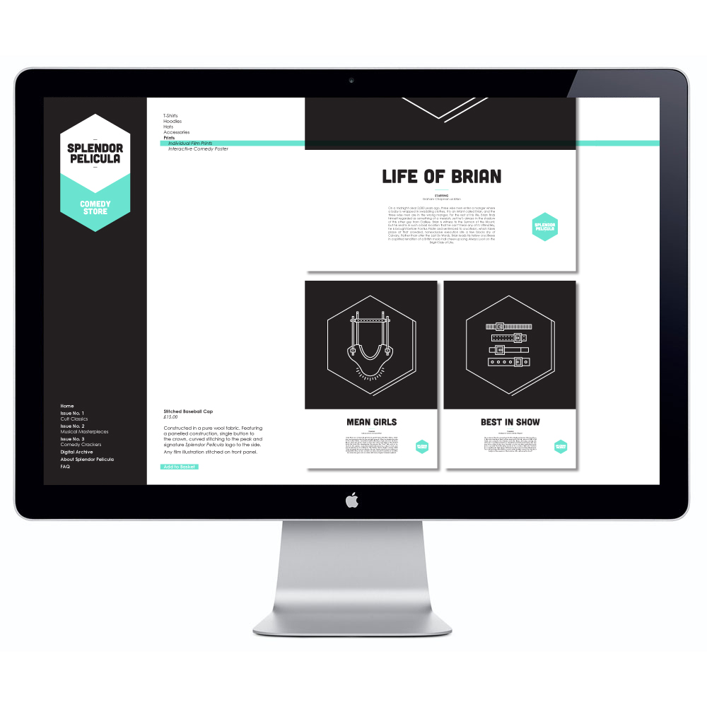
For the past few days I have been working on bringing together all my resolutions for my Splendor Pelicula brief. I knew I wanted to design a website, as I feel it brings a real sense of resolution to the process, and it makes it in general a lot more 'believable'. I knew I wanted it to be sleek, sophisticated and incorporate the artwork I have created for the publications. Another aspect I considered was separating the three different genres of film I have worked with and designing separate web sections for each, using the three pastel colours. I spent quite a lot of time trying to manipulate imagery and proposing merchandise designs through pre-existing photography and then adding my illustrations. The next step was then to place all these images into some sort of continuous layout that was flexible enough to work for several different pages. I think I managed to resolve that problem by having a repeated bar down the left hand side of the composition, and always ensuring the logo is pride of place.
The majority of the page designs are for the 'online store', however there is also the digital archive section of the site, for which I had to create what looked like a realistic flip book visual. I tried to keep that page as white as possible, so as not to detract from the content of the publication. All in all I think the pages work well together, and are different yet similar enough to work as a group or individually. The layout designs are simple enough to expand into printed merchandise catalogues if I so desired, but I think this might be somewhat of an unnecessary step.
The next step in wrapping up this brief is to design the same amount of web pages for the other two genres of film: cult and musical. This can be easily done, as all that needs changing is the colour, some text, and the visuals on the merchandise shots. After this I will have to apply some of the page designs to computer shots, giving them a more visceral quality and real world application.
Web Mock Ups
Just a few early mock up shots of what the web pages might look like in situ. I need to work on perspective and dimensions a little more, but I think with a little more work, and accompanying motion support, they will look more than believable. I also am considering looking into applying the graphics to the screens of iPhones and iPads, hopefully this will take it that one step further in a fully fleshed out brief. The page designs are not finalised at this point, and are therefore subject to change. More updated ones will be posted later.

Working on Web Layout
Today I decided to attempt using After Effects to try and communicate how my intended Splendor Pelicula webpage would function. It's the first time I've used the programme in a long, long time. And after my previous failed attempts at creating moving animations I was incredibly apprehensive. However, I came to the realisation that my proposed web page designs would not be enough on their own, I would need some sort of method of communicating how people would interact with the designs. So I kept it simple and just decided to tackle the home page for the website.
My intended animation combines all the different aspects that span across my film zine inspired brief. These include the three pastel colours; pink, blue and green, the typeface Cubano, and the hexagonal shape. I think the animation itself is simple but effective. There is no mistaking it for anything else, it's a clear extension of my physical deliverables for the brief and I hope is successful in clearly outlining the three different genres of film I have worked with.
Obviously I will experiment with a few more compositions, and perhaps come up with a more fluid movement of the cursor and the way in which the bottom icons appear. But for the time being I have had a pleasant experience with the software I was once terrified of, and am content to alter the animation at a slightly later date. Though not much later as I may forget how to use After Effects again. Below is a screen shot of the window I was working with, and as you can see all the assets are neatly organised, cutting down the levels of stress for me.

My intended animation combines all the different aspects that span across my film zine inspired brief. These include the three pastel colours; pink, blue and green, the typeface Cubano, and the hexagonal shape. I think the animation itself is simple but effective. There is no mistaking it for anything else, it's a clear extension of my physical deliverables for the brief and I hope is successful in clearly outlining the three different genres of film I have worked with.
Obviously I will experiment with a few more compositions, and perhaps come up with a more fluid movement of the cursor and the way in which the bottom icons appear. But for the time being I have had a pleasant experience with the software I was once terrified of, and am content to alter the animation at a slightly later date. Though not much later as I may forget how to use After Effects again. Below is a screen shot of the window I was working with, and as you can see all the assets are neatly organised, cutting down the levels of stress for me.
Tuesday, 1 May 2012
Zine: T-Shirt Progress
I want to propose some T-shirt designs, but from previous experience I aways leave mocking up to the last minute and it always looks terrible. So I wanted to start early on it and create some visuals that are lot more engaging and pack a punch. I gathered some exisiting images, then altered them in photoshop to create a range of shots that are a lot more applicable to my brief. More experimentation is needed but I am happy so far with the mock up shots.
Final Individual A3 Posters
I decided my publications needed a lot more support work to bring a sense of finality to them, so I took the illustrations for each and every film I worked with and enlarged them to create individual prints. I figured the posters would be available for purchase on the website I will design at a later date. I also figured that I wanted to fold them in an interesting way, and therefore it would be more impressive if there was a pattern on the reverse of the print. For each of the genres I used a pattern I generated combining the individual icons into a large scale collage and then overlayed the appropriate colour. I placed the logo in the bottom left corner so when the A3 sheet is folded, it will be the first thing visible.
Final A2 Posters
I wanted to create a poster that was not just a visual, but also interactive. Not just something to stick up on the wall and forget about, but instead something to continuously revisit and remain in the mind set of truly experiencing films, not brainlessly letting them go in one ear and out the other. So I decided to design an A2 double sided print, on one side a pattern of the illustrations, and on the other side the corresponding film titles and the space to apply an amount of stickers, from one to three, and in turn assign a personal rating to each and every film. I think it works because it reinforces the idea of sticking with the provided list, and searching out the features to view them. I also think it's something that a lot of people wouldn't be happy half finishing, but instead would not be happy until all eighteen features are seen and reviewed. Due to the additional supply of a sticker sheet with this poster, it's something that would only be available through the website, and will need some sort of external packaging to tie it all together. But with all the visuals pretty much at my disposal now, this won't take long.
Final Layouts: Zine & Leaflets
I finally finished the remaining two zines I had been working towards; musical and comedy. Below are flip books of the publications, of which I will turn into PDF's and send off to an outside source to get professionally printed.
I also wanted to create a publication that was a lot more concise than the zine itself, and instead just contained the eighteen films recommended in the publications. I also wanted the creation to be a little more interactive so I made three 'pamphlets', all of which have a small tab that will be perforated, and therefore once each film has been viewed a tab can be removed. I think this will bring a sense of fun to the customer who wishes to purchase the publication and really engages with the whole concept of the brief. I also added plenty of space for notes to be taken on the reverse of each page. I know from personal experience when watching a film I'll recognise a face, or hear a line of dialogue I particularly like, and wish I had a way of remembering it. But by the time it finishes I've completely forgotten what I wanted to remember, hopefully this will solve that problem!! It's also a handy size that allows for easy transportation, fitting into almost any pocket. Below are flip books of the three pamphlets.
I also wanted to create a publication that was a lot more concise than the zine itself, and instead just contained the eighteen films recommended in the publications. I also wanted the creation to be a little more interactive so I made three 'pamphlets', all of which have a small tab that will be perforated, and therefore once each film has been viewed a tab can be removed. I think this will bring a sense of fun to the customer who wishes to purchase the publication and really engages with the whole concept of the brief. I also added plenty of space for notes to be taken on the reverse of each page. I know from personal experience when watching a film I'll recognise a face, or hear a line of dialogue I particularly like, and wish I had a way of remembering it. But by the time it finishes I've completely forgotten what I wanted to remember, hopefully this will solve that problem!! It's also a handy size that allows for easy transportation, fitting into almost any pocket. Below are flip books of the three pamphlets.
Wednesday, 21 March 2012
Tuesday, 20 March 2012
Friday, 16 March 2012
Zine Front Cover Development
After Si Scott gave me a great idea for the front cover designs of my film zine, I spent the morning trying to finalise the basic template. I knew I had the basic shape of the zines logo, and the name of the publication. However I was still uncertain over the typeface and the colour choices for all six issues. After some experimentation seen below I settled on a typeface called 'Cubano' for the name as it's bold and legible enough to be read from a distance, whilst still remaining fun and light hearted with its slightly rounded strokes. I also settled on the six different colours for the issues, with a lighter and a darker pastel for pink, blue and green being chosen. I think by technically using only three colours, I could take Fred's advice and in some way connect two issues, be it through a director, a regular cast member or even a popular year of release. I think it's important that some sense of continuity it reflected throughout the series of issues.
Tuesday, 13 March 2012
Zine Front Cover Idea
I found this image and thought it was the perfect way of communicating what I intend to recreate on the front cover of my film zine. The mix of playful and colourful illustration with the simple editorial banner at the top of the composition is perfect. I obviously don't want my efforts to appear as though I am simply replicating the image below, but the similarities are uncanny.

Friday, 2 March 2012

Goran
I would like for the thumbnail sized illustrations I create for my film zine to be similar to the ones seen below, created by 'Goran'. His use of simple lines is incredibly effective, and the drawings appear minimal yet have so much detail. I do not wish to use colour, unlike Goran, hopefully black and white will suffice.


Brainstorming Film Objects
In order to create a contents page for my film zine I had an idea that I think would be both visually engaging and resonate with film fans. The idea itself is to take a memorable object from each film and create a thumbnail sized illustration, this little image will then be assigned to the corresponding films, appearing on the appropriate pages, and adding an extra sense of continuity throughout the publication. However, after following Mark's advice, I don't want to just jump straight in, so I quickly jotted down a few drawings for my list of movies. The quick sketches can be seen below, and I will soon develop them further.


Thursday, 1 March 2012
Black Chronicle of Five Centuries
About: The book is about the criminal events took place in and around the medieval town of Sopron. The writer (Jenő Szabó) collected the most interesting crime cases from it's history. The book is almost 200 pages, not too long but has many chapters, and every chapter has a coat of arms styled illustration. The cover is based on the etching of Zakariás Michel from 1700 and shows one of the big fires of the town. The side notes conatins the translations and the explanations of the foreign words and sentences.
___________________________________________________________________________
I really like this publication and it has given me a good idea for my film zine. I love to illustrate and this has shown to me how I can incorporate individual designs for the films and combine into something that works as a series.

___________________________________________________________________________
I really like this publication and it has given me a good idea for my film zine. I love to illustrate and this has shown to me how I can incorporate individual designs for the films and combine into something that works as a series.

Subscribe to:
Posts (Atom)