This module had proved to be the most difficult module to date, though that was always going to be the case. I have learnt both positive and negative things about myself, and my design practice, throughout the duration of the module. It has been an eye opening experience, and though at times it may have been overwhelming, I think I leave the course with a clearer idea as to what my design future entails.
A positive taken from this module is the discovery that I am fully capable of producing high quality, visually engaging design using a range of different illustration techniques. Though illustration has always been part of my previous modules, it has never been the sole focus. With this module I took it upon myself to work with a range of illustrative approaches as a creative challenge. I consider myself to have succeeded in several areas, and confirmed to others and myself that I am a visually driven designer. If people where to see me as an illustrator, I would have no problem with that.
Collaborative briefs, such as the DFGA yearbook and the fashion branding, have shown me that I am not a natural leader. I have struggled when it comes to organising people and setting personal deadlines. I always knew it wasn’t in my nature to take charge of situations, and this module has reaffirmed that theory in my mind. However, this is not to say that I am incapable of expressing my opinions when necessary. During DFGA meetings I presented my design work with conviction and clarity, something which I feel aided Mike in choosing my page layouts to develop further. I also made it clear to my fashion student certain ideas she had envisioned in her mind simply would not work for her branding, and instead we came to creative compromises. I have most definitely learnt the hard way that working with a client is a challenge, both mentally and creatively. It’s not something I wish to do again any time soon.
If I where to do the module again there are certain things I would do differently. I may say this at the end of every module, but I should have blogged more. At points I was completely on top of my blog posts, each one with appropriate imagery and thorough supporting analysis. Yet there where also moments when I let it build up, almost to the point where it was difficult to get back on track. This is something I regret now. I would also have picked my briefs a lot earlier, and exploit to their full potential rather than waiting for each to develop at it’s own pace leaving me with few options due to time constraints. Time management has been a big issue for me. Unable to work on more than one brief at a time I should have been organised and assigned weeklong deadlines, and stuck to them. But I just didn’t.
I come out of this final module with a skewed outlook as to what the future holds. At times I have felt graphic design is the only career path I can take. At others it has felt like I have no place within the industry. It would be hard for me to evaluate my time during this module without sounding negative, perhaps even cynical. With additional personal issues to deal with, graphic design should have taken precedence; it should have been an outlet for me. But it wasn’t. It became something I avoided because I couldn’t handle the fact I wasn’t achieving the level of professionalism I assumed I would so late on the course. More than anything I have come to the conclusion that making ‘pretty pictures’ isn’t enough, yet it seems this is all I am capable of. I’m not entirely sure what the future holds for me, but if it involves some sort of illustration then I would be more than happy.

Showing posts with label Brief 04: Fashion Branding. Show all posts
Showing posts with label Brief 04: Fashion Branding. Show all posts
Tuesday, 29 May 2012

Evaluation: Tryptik Fashion Branding
This brief was undoubtedly the most stressful of all my briefs.
Firstly, I was out of my comfort zone. I was doing branding, creating logos and applying them to a range of different products, working in black and white, working with a lot of text. All aspects of design that I feel I can work with, but don't feel at my most comfortable. The stress of this brief was certainly not helped by the fashion student herself.
I am aware we where told to set deadlines for our collaborations and we should be stern with our fashion students, but it's just not in my nature to be like that. Well, it wasn't in my nature. It is now. This brief has taught me that I will not get anywhere if I let people walk all over me. I need to be more forthright and tell people what I really think about certain things. Not once did I make it clear to my fashion student that I felt unappreciated and as if she was walking all over me. I realise now that the collaboration is over that I have had completely the wrong attitude. I needed to be more demanding and express my concerns. Nevertheless it is done with now, and it has certainly taught me that I need to be more vocal in the future.
I think for quite a few students on the graphic design course, the collaborative fashion branding brief was the most engaging and important brief of the entire three years. It's where they discovered a field of design that they love, something they might even consider exploring after graduation. As if everything fell into place and they had the perfect outlet for combing their love of type layout, branding and promotional product creation. This is not the case with me.
I would be lying if I said I did not enjoy the brief at all. I appreciate that it encouraged me to work in a way I would have previously ignored. I just felt stifled. I couldn't create products that where amazing because I didn't feel a connection to them. I didn't have a personal investment and in turn could not get excited about all the possibilities. Perhaps it is shallow of me to say this, and I should be driven by something more than my subject matter. But if I plan on achieving my goals of working within the entertainment industry then I can no longer come to creative compromises.
In hindsight I probably shouldn't have picked this brief. I should have told Samantha, the fashion student, that I had no interest in her collection and creating a brand for her. But you live and learn. And it is nice to know that I'm not a one trick pony. I can apply myself to other creative fields if necessary.
Monday, 28 May 2012
Final Products: UPDATE
Today I was informed by Samantha that she required ALL the deliverables I had created for her branding. This put me in a little bit of a blind panic. She has a deadline of 3pm tomorrow. I have no print sessions left. If I had known this was the case a few weeks ago I would have organised it to give myself a little more time to create duplicates for myself.
Unfortunately this means I will not be submitting any physical products for the brief. I will try to get as many good product shots as I can before the products are taken off my hands at 3pm tomorrow. But I am slightly worried that without physical objects, you will not be able to gauge the effort an care that was put into assembling them. Nor will the stick choices be evident. Ugh, fashion. Just another reason to add to the long list of reasons why I have not enjoyed this brief.
Unfortunately this means I will not be submitting any physical products for the brief. I will try to get as many good product shots as I can before the products are taken off my hands at 3pm tomorrow. But I am slightly worried that without physical objects, you will not be able to gauge the effort an care that was put into assembling them. Nor will the stick choices be evident. Ugh, fashion. Just another reason to add to the long list of reasons why I have not enjoyed this brief.
Sunday, 27 May 2012
Printed & Assembled Packaging Items
Today I was able to print and assemble the exterior packaging for Samanatha's collection. This included a double sided print for the bag, and a double sided print for the box found inside the bag.
The bag itself is printed on one sided 300 gsm silver stock. The logo is featured on just one side. Black eyelets have been used to hold the 5mm black rope for the handles. Inside the bag is a repeated pattern of a white tryptik triangle on a black background. I was initially unable to print double sided on the stock as the silver side did not absorb the ink. I had to wait a while, actually a whole day, for it to dry and then feed it back through to achieve the desired effect. Even though this was a little frustrating, I was very pleased with the final results, and if needed would do the same thing again.


Inside the silver bag is a constructed black box, complete with printed tracing paper for extra padding. The box itself is incredibly simple in design, but this is what Samantha requested so I was left no other option than adhering to her requirements. I tried to bring a little something extra to the product by having a a repeated pattern placed on the bottom of the bottom part, and a single triangle on the inside of the top part.

Below is an image of what the box looks like within the bag. The fit is quite snug, but due to the large nature of Samantha's garments and the printing restrictions I was faced with I could only do my best.

The bag itself is printed on one sided 300 gsm silver stock. The logo is featured on just one side. Black eyelets have been used to hold the 5mm black rope for the handles. Inside the bag is a repeated pattern of a white tryptik triangle on a black background. I was initially unable to print double sided on the stock as the silver side did not absorb the ink. I had to wait a while, actually a whole day, for it to dry and then feed it back through to achieve the desired effect. Even though this was a little frustrating, I was very pleased with the final results, and if needed would do the same thing again.


Inside the silver bag is a constructed black box, complete with printed tracing paper for extra padding. The box itself is incredibly simple in design, but this is what Samantha requested so I was left no other option than adhering to her requirements. I tried to bring a little something extra to the product by having a a repeated pattern placed on the bottom of the bottom part, and a single triangle on the inside of the top part.
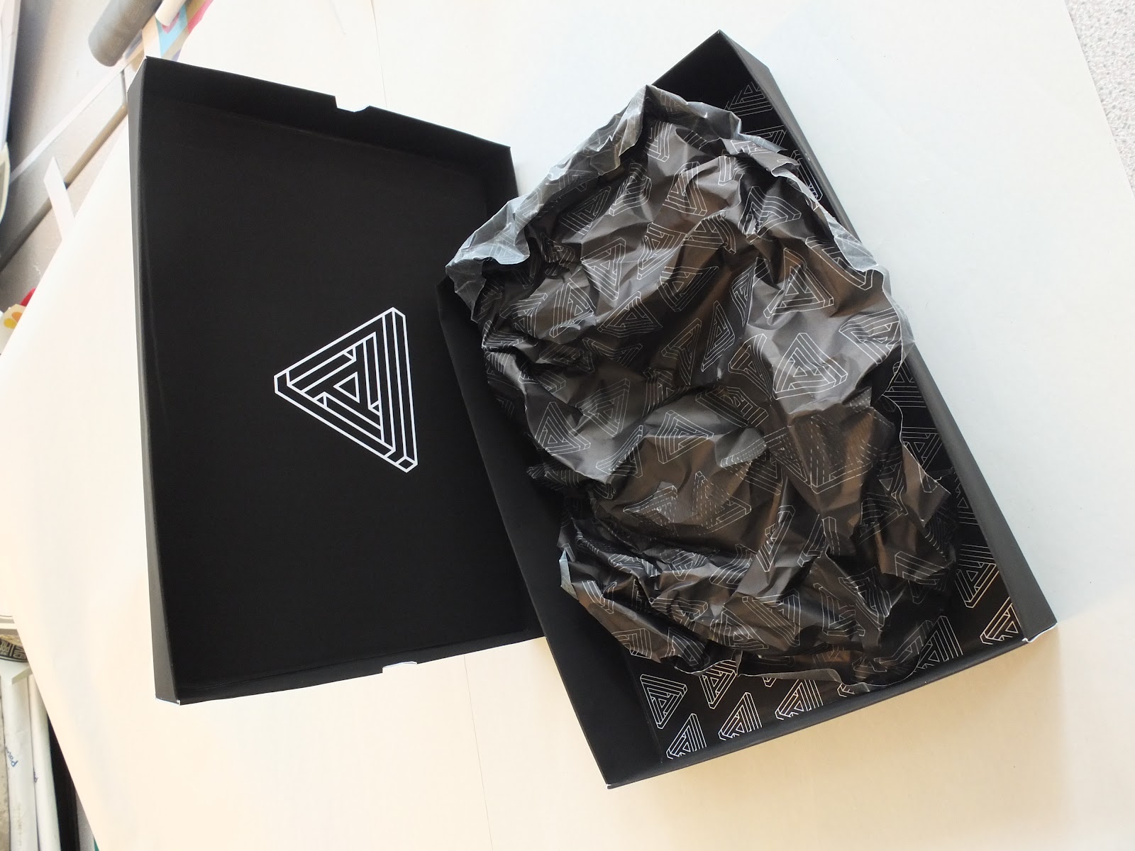
Below is an image of what the box looks like within the bag. The fit is quite snug, but due to the large nature of Samantha's garments and the printing restrictions I was faced with I could only do my best.

Final Product Shots
Today I managed to complete my fashion branding brief. It was a real struggle to work to my schedule when Samantha had been given an extension. She was working towards dates that meant I had very little time to bring together resolutions and have them printed on the right stock and to the right format.
Below is a shot of the business cards. Having designed the logo quite a while ago this was a part of her stationery that I was able to stay on stop of. It took a lot for me to receive her approval. Let's just say she wasn't scared to make her opinions known. I advised that a triangular business card was perhaps not the best option, but she insisted. Nevertheless I am pleased with results, and think this unique approach sets her apart from the rest of her graduating year. Something she wanted more than anything.

Another deliverable I was able to complete today was the triangular look book. After being given the images only a few days ago, I was left just a few days to develop a design that was both practical and satisfied her quirky requirements. The book itself was printed in three X3 sections, resulting in a 46 page publication, with additional front and reverse covers. I bound the publication with a coptic stitch, and then covered the seam with a strip of black cotton Samantha had used in her collection.
Below are a few product shots that show the book layout in action. It took a while to figure out how the images and text would be printed correctly, but I was incredibly proud when it all came together with no complications.


Below is a shot of the business cards. Having designed the logo quite a while ago this was a part of her stationery that I was able to stay on stop of. It took a lot for me to receive her approval. Let's just say she wasn't scared to make her opinions known. I advised that a triangular business card was perhaps not the best option, but she insisted. Nevertheless I am pleased with results, and think this unique approach sets her apart from the rest of her graduating year. Something she wanted more than anything.

Another deliverable I was able to complete today was the triangular look book. After being given the images only a few days ago, I was left just a few days to develop a design that was both practical and satisfied her quirky requirements. The book itself was printed in three X3 sections, resulting in a 46 page publication, with additional front and reverse covers. I bound the publication with a coptic stitch, and then covered the seam with a strip of black cotton Samantha had used in her collection.
Below are a few product shots that show the book layout in action. It took a while to figure out how the images and text would be printed correctly, but I was incredibly proud when it all came together with no complications.


Thursday, 24 May 2012
Assembled Swing Tags
Another day, another assmebled resolution to my fashion branding brief. Today I was able to print and assemble the swing tags for the 'Tryptik' collection. I was incredibly pleased with the results. I think the reason for my satisfaction with the swing tags is how nicely all the different elements came together.
The tags themselves are composed of three different elements. Firstly is a 40mm wide piece of mirror with the tryptik triangle ecthed onto one side. Next is piece of tracing with the triangle printed on in black ink, laid over the greyscale diamond patter. On the reverse of this pattern is all the necessary information for the individual garments. These two stocks are held together with a stainless steel 5mm eyelet.
The last component of the swing tags is another triangle, this time printed using the single silver sided stock. On the white side is the inspiration behind the collection. This tag is finished off with a 5mm matte black eyelet, chosen to contrast the silver stock. All the different elements are brought together with a 3mm stainless steel chain measuring roughly 200mm, allowing a 100mm drop length.
I think the tags work really well because of the many different ways the logo is featured; printed on different stock in different colours, and even etched into mirror. Samantha was incredibly pleased, and so was I!


The tags themselves are composed of three different elements. Firstly is a 40mm wide piece of mirror with the tryptik triangle ecthed onto one side. Next is piece of tracing with the triangle printed on in black ink, laid over the greyscale diamond patter. On the reverse of this pattern is all the necessary information for the individual garments. These two stocks are held together with a stainless steel 5mm eyelet.
The last component of the swing tags is another triangle, this time printed using the single silver sided stock. On the white side is the inspiration behind the collection. This tag is finished off with a 5mm matte black eyelet, chosen to contrast the silver stock. All the different elements are brought together with a 3mm stainless steel chain measuring roughly 200mm, allowing a 100mm drop length.
I think the tags work really well because of the many different ways the logo is featured; printed on different stock in different colours, and even etched into mirror. Samantha was incredibly pleased, and so was I!


Wednesday, 23 May 2012
Look Book Double Page Spreads
After getting the go ahead from Samantha I was able to press forward with the look book layout.She approved of an image being used on the right hand side page, and all the corresponding information on the left. She also liked the fact that I used the diagonal spine of the book as alignment for the text. This was something I then went on further to explore, before ultimately settling on the designs seen below. Also below you an see how I dealt with laying out the text heavy pages, and how I incorporated the greyscale pattern I designed.
She wanted a way of using the logo on each page and if possible having page numbers. So I settled on the approach shown below on the artwork. It's a reflection of the way the pages themselves are laid out.


She wanted a way of using the logo on each page and if possible having page numbers. So I settled on the approach shown below on the artwork. It's a reflection of the way the pages themselves are laid out.
Tuesday, 22 May 2012
Look Book Development
Today I started working on the layout for the look book. I knew I'd be working with a triangle so I wanted to get on with it, and establish any potential issues early on. Luckily I wasn't faced with that many issues, I was even pleasently surprised with the range of layouts I was able to generate for such awkward dimensions. Below are a few screens shots and flip books showing how I got from one stage at the beginning to ideas that I intend to take further once I have Samantha's approval.


Tuesday, 15 May 2012
Finalising Mailshot Artwork
I have working in conjunction with Samantha to create a mailshot that she felt best reflected her garment collection. I knew from previous experiments that she was a fan of me designing a hexagon shape, that when folded twice becomes a triangle. It allows for interaction, and displays each of the outfits in the most optimum way. The basic idea is a double sided print that has pure imagery on one side, and the reverse features the appropriate written information. She made it clear to me that she wanted black used as the predominant colour on the reverse, which made it vital for me to display the white text in the most legible way. Below is the finalised artowkr for the foldable mailshot.
Thanks to Samantha's insistence, I was able to get my hands on six of the edited images for the look book. I placed these in the below composition. After consulting Samantha she was really happy with the results, therefore I plan on printing as many as I can at my next print session. I hope to god I get the two sides to line up correctly. I'll have to use quite a large bleed on the black side to ensure the results are as effective as I want.

Thanks to Samantha's insistence, I was able to get my hands on six of the edited images for the look book. I placed these in the below composition. After consulting Samantha she was really happy with the results, therefore I plan on printing as many as I can at my next print session. I hope to god I get the two sides to line up correctly. I'll have to use quite a large bleed on the black side to ensure the results are as effective as I want.
Wednesday, 9 May 2012
Constructing Bag
I got up extra early this morning to hopefully get myself a slot at drop in with James in the print room. I was there early enough to get right at the front of the queue and managed to print off what I had intended, which included: a double sided bag net, a double sided envelope layout and the accompanying tracing paper design for the mail out. Once I had the items printed I then went about constructing them. I knew it might be a complicated process, and one to great care over so I did.
With lots of double sided sticky tape, a scalpel, a ruler and a line scorer I was able to construct a near perfect bag. I was pleased with the results, and all left to do now is incorporate the eyelets and string we have chosen for the handles to create a fully finished bag. Images showing my progression can be shown below.


With lots of double sided sticky tape, a scalpel, a ruler and a line scorer I was able to construct a near perfect bag. I was pleased with the results, and all left to do now is incorporate the eyelets and string we have chosen for the handles to create a fully finished bag. Images showing my progression can be shown below.


Tryptik: Business Cards
Today I had a serious discussion with Samantha about her branding, more specifically her business cards. I have known for a while that due to the triangular nature of her logo, and of course the prominence of triangles within her pattern cutting, she was interested in having a triangular business card. I was obviously apprehensive as it's not the done thing, however after her insistence on the issue I had no other option than to start proposing option for this rather unusual piece of stationery.
Something to bear in mind is also the fact that a lot of Samantha's packaging, such as swing tags etc, and promotional materiel, such as the look book, will also be triangular. I think when it's all brought together it will look really impressive, and not as unusual as it may first appear.
My biggest issue with the triangular approach was the three harsh corners. Business cards are supposed to be durable and withstand being taken in and out of a wallet as many times as possible, so with such defined corners there was a strong chance they would become worn and blunted, therefore ruining her desired intention of clean cut lines and a high standard of professionalism. After a few words I managed to convince her that it would be for the best that we preemptively blunt the corners. This way they will withstand more use, and it is also a continuation of the logo design itself.
The shot below shows the progression from top to bottom. Initially starting with a triangle and gradually working towards a design that is more practical, and of course legible.

Below is a flip book showing the three final options I have designed for the information side of the business card. I will present the three options to Samantha, and upon her decision will take one and run with it. Hopefully she likes one!
Below are the front and back of two A3 sheets showing the final business card compositions. All that is left to do now is print them on the intended stock and cut them out as neatly as possible. I'm not sure how many Samantha will require at this moment in time, so I will start with just a small run.


Something to bear in mind is also the fact that a lot of Samantha's packaging, such as swing tags etc, and promotional materiel, such as the look book, will also be triangular. I think when it's all brought together it will look really impressive, and not as unusual as it may first appear.
My biggest issue with the triangular approach was the three harsh corners. Business cards are supposed to be durable and withstand being taken in and out of a wallet as many times as possible, so with such defined corners there was a strong chance they would become worn and blunted, therefore ruining her desired intention of clean cut lines and a high standard of professionalism. After a few words I managed to convince her that it would be for the best that we preemptively blunt the corners. This way they will withstand more use, and it is also a continuation of the logo design itself.
The shot below shows the progression from top to bottom. Initially starting with a triangle and gradually working towards a design that is more practical, and of course legible.

Below is a flip book showing the three final options I have designed for the information side of the business card. I will present the three options to Samantha, and upon her decision will take one and run with it. Hopefully she likes one!
Below are the front and back of two A3 sheets showing the final business card compositions. All that is left to do now is print them on the intended stock and cut them out as neatly as possible. I'm not sure how many Samantha will require at this moment in time, so I will start with just a small run.


Tuesday, 8 May 2012
Look Book Envelope
Below are the printable artworks for the external elements to Samantha's look book design. The first image would be printed onto thin, ideally 135gsm matte stock whilst the second image would be printed on the reverse side.


Experimenting: Look Book
I know for a fact that one side of the look book will be purely image, and the reverse will be purely typography. In order to move the composition along I need to experiment with what the layout of the text on the back side will look like. I still don't have the actually copy at this moment in time, so for now I am using placeholder text. Below are two of my main options; using black text on a white background, or white text on a black background. I also tried to incorporate the logo yet again, but I'm not sure Samantha will like this. I can hear her now comparing it to a spiders web. Still, it's a step in the right direction, and an approach to definitely explore further.


Look Book: Exterior Packaging
Due to Samantha insisting that she just wants a folded leaflet design for her look book, I think it's important to add another element that will bulk out the final composition. At first I suggested a simple sleeve to place over and hold the folds in place, however this idea was then rejected when we realised the logo placement may cause some problems. So after I suggested some sort of envelope/box for the look book to be held in we settled on the design found below. It continues the approach found with the previous packaging, black as the main colour with the logo featured largely on the front and much smaller but repeated on the inside. The right hand page seen below is a basic layout to be printed on very fine tracing paper, of which will wrap the folded look book in place and protect it slightly. The tracing paper will be held in place with a small sticker, again just another version of the triangular design.

Final Net: Internal Box
At Samantha's insistence I was able to create the appropriately sized net. The box itself will be held within the large scale bag (the net of which can be seen in the previous post) and contain each one of her final garments. She insisted that all her final creations are similarly sized and therefore there would be no need for a range of box sizes. She also insisted that the design be simple yet effective, so we settled on black in large amounts and the reversed out logo on the top side of the box.

On the inside of the top section of the box there will be the smaller repeated pattern, seen on the left hand side of the image below. I think this is important, as I don't want the black to become too overwhelming. The image on the right hand side of the below screen capture is of the design that will be found on the interior of the bottom section. It is a slightly smaller version of the triangle found on the very front, and still does not feature the name of the company, a decision purposely made.

The final section of the construction can be seen below. There's not much to be said for the design of the net, it's purely black, however the size is slightly smaller so the top section slides neatly over the top. This is a detail I have forgot with previous box construction and have come up against major problems. By dealing with this early on hopefully I will have no problems. The only other component of the box is what will be found on the inside. Samantha wants to print the repeated pattern onto plain tissue paper, I will have to look into whether this is even possible.

On the inside of the top section of the box there will be the smaller repeated pattern, seen on the left hand side of the image below. I think this is important, as I don't want the black to become too overwhelming. The image on the right hand side of the below screen capture is of the design that will be found on the interior of the bottom section. It is a slightly smaller version of the triangle found on the very front, and still does not feature the name of the company, a decision purposely made.
The final section of the construction can be seen below. There's not much to be said for the design of the net, it's purely black, however the size is slightly smaller so the top section slides neatly over the top. This is a detail I have forgot with previous box construction and have come up against major problems. By dealing with this early on hopefully I will have no problems. The only other component of the box is what will be found on the inside. Samantha wants to print the repeated pattern onto plain tissue paper, I will have to look into whether this is even possible.
Final Net: Large Scale Bag
After a brief discussion with Samantha, we came to a conclusion on the design of the bag I will be producing as a resolution to the brief. She said she only wanted the logo featured on one side of the bag, to which I was a little apprehensive, however if this is what she wants then I have to respect her decisions. The bag itself is incredibly simple, mostly negative space, a large scale logo and the handles will be black in contrast the overwhelming amount of white.

However, to bring a more rounded finish the bag design I managed to convince Samantha that there should be some form of internal pattern. We settled on the one found below. I think it's important to have black as the predominant colour, as it will look great in contrast to the exterior of the bag. It's also a detail that most will not instantly notice, but once they look closer, they will appreciate the attention to detail. I took the triangular design and rotated it 60 degrees each time, resulting in six different iterations of the same basic shape. I then simply aligned them horizontally and equally spaced them, after which I layered the design to fill the space.

However, to bring a more rounded finish the bag design I managed to convince Samantha that there should be some form of internal pattern. We settled on the one found below. I think it's important to have black as the predominant colour, as it will look great in contrast to the exterior of the bag. It's also a detail that most will not instantly notice, but once they look closer, they will appreciate the attention to detail. I took the triangular design and rotated it 60 degrees each time, resulting in six different iterations of the same basic shape. I then simply aligned them horizontally and equally spaced them, after which I layered the design to fill the space.
Look Book Idea Generation
After a discussion with Samantha, in which she implied she would not require a form of 'publication' for her look book, we settled on an interestingly folded leaflet. Due the shape of her triangular logo, and the prevalence of triangles within her final collection, we came up with the idea of taking this and multiplying it to form a hexagonal shape. The print will be double sided; one side being purely image based, and on the reverse the accompanying information for the items found in each photo. Though I still have no images to work with at the moment, Samantha has insisted that they will be black and white, and shot in a studio. There will be no exterior elements to the photography; simple and sleek is the direction in which we are head.
So I went ahead and experimented with composition and logo placement. Due to the one side being pure photography I think it's important to incorporate the logo in some way. I feel if it wasn't featured, be it in an incredibly subtle way, the message would be lost and the layout may not look like a continuation of all the other items I will be creating for the resolutions.
From the range of layouts I created in the above flip book I took three of my favourites and expanded them slightly. I then printed them off and, though not to scale, was given an impression of how successful each one was. The three that I decided to take to the next level of experimentation are seen below. Each one has positives and negatives, and the placement of the triangular logo seems to be vital in communicating a message. I will have to discuss the options with Samantha and see which one she is most impressed with.


So I went ahead and experimented with composition and logo placement. Due to the one side being pure photography I think it's important to incorporate the logo in some way. I feel if it wasn't featured, be it in an incredibly subtle way, the message would be lost and the layout may not look like a continuation of all the other items I will be creating for the resolutions.
From the range of layouts I created in the above flip book I took three of my favourites and expanded them slightly. I then printed them off and, though not to scale, was given an impression of how successful each one was. The three that I decided to take to the next level of experimentation are seen below. Each one has positives and negatives, and the placement of the triangular logo seems to be vital in communicating a message. I will have to discuss the options with Samantha and see which one she is most impressed with.
Subscribe to:
Posts (Atom)