This module had proved to be the most difficult module to date, though that was always going to be the case. I have learnt both positive and negative things about myself, and my design practice, throughout the duration of the module. It has been an eye opening experience, and though at times it may have been overwhelming, I think I leave the course with a clearer idea as to what my design future entails.
A positive taken from this module is the discovery that I am fully capable of producing high quality, visually engaging design using a range of different illustration techniques. Though illustration has always been part of my previous modules, it has never been the sole focus. With this module I took it upon myself to work with a range of illustrative approaches as a creative challenge. I consider myself to have succeeded in several areas, and confirmed to others and myself that I am a visually driven designer. If people where to see me as an illustrator, I would have no problem with that.
Collaborative briefs, such as the DFGA yearbook and the fashion branding, have shown me that I am not a natural leader. I have struggled when it comes to organising people and setting personal deadlines. I always knew it wasn’t in my nature to take charge of situations, and this module has reaffirmed that theory in my mind. However, this is not to say that I am incapable of expressing my opinions when necessary. During DFGA meetings I presented my design work with conviction and clarity, something which I feel aided Mike in choosing my page layouts to develop further. I also made it clear to my fashion student certain ideas she had envisioned in her mind simply would not work for her branding, and instead we came to creative compromises. I have most definitely learnt the hard way that working with a client is a challenge, both mentally and creatively. It’s not something I wish to do again any time soon.
If I where to do the module again there are certain things I would do differently. I may say this at the end of every module, but I should have blogged more. At points I was completely on top of my blog posts, each one with appropriate imagery and thorough supporting analysis. Yet there where also moments when I let it build up, almost to the point where it was difficult to get back on track. This is something I regret now. I would also have picked my briefs a lot earlier, and exploit to their full potential rather than waiting for each to develop at it’s own pace leaving me with few options due to time constraints. Time management has been a big issue for me. Unable to work on more than one brief at a time I should have been organised and assigned weeklong deadlines, and stuck to them. But I just didn’t.
I come out of this final module with a skewed outlook as to what the future holds. At times I have felt graphic design is the only career path I can take. At others it has felt like I have no place within the industry. It would be hard for me to evaluate my time during this module without sounding negative, perhaps even cynical. With additional personal issues to deal with, graphic design should have taken precedence; it should have been an outlet for me. But it wasn’t. It became something I avoided because I couldn’t handle the fact I wasn’t achieving the level of professionalism I assumed I would so late on the course. More than anything I have come to the conclusion that making ‘pretty pictures’ isn’t enough, yet it seems this is all I am capable of. I’m not entirely sure what the future holds for me, but if it involves some sort of illustration then I would be more than happy.

Tuesday, 29 May 2012

Evaluation: Sitcom Standards
Another illustratively driven brief, this one encouraged my hand rendering skills. I had always been slightly apprehensive about using my hand drawn illustrations within my work before. I had no confidence with them, and as if people would look down at me if they did not the style. I realised I would need to get over this fact if I was going to fully explore the idea of my becoming an illustrator. I needed to explore illustration in all senses of the word.
With my Splendor Pelicula brief I was working with computer rendered, black line icon illustrations and with my skate branding brief I was working with rounded, colourful, computer vectorised illustrations. This brief was designed to help me develop my hand drawings abilities, with an obvious digital inclusion at the end of the drawing process. It also helped improve my character depiction.
I chose the subject matter mostly because I had dealt with film in an earlier brief and was therefore left with the television option. I could have left it out of this module, but figured if I was to be seen as seriously interested in representing popular culture I would need to include it. Also, I had been watching a lot of It's Always Sunny In Philadelphia to get me through my other briefs. I guess the zany characters seeped into my subconscious and I felt it necessary to depict them in any way that I could.
With my Splendor Pelicula brief I was working with computer rendered, black line icon illustrations and with my skate branding brief I was working with rounded, colourful, computer vectorised illustrations. This brief was designed to help me develop my hand drawings abilities, with an obvious digital inclusion at the end of the drawing process. It also helped improve my character depiction.
I chose the subject matter mostly because I had dealt with film in an earlier brief and was therefore left with the television option. I could have left it out of this module, but figured if I was to be seen as seriously interested in representing popular culture I would need to include it. Also, I had been watching a lot of It's Always Sunny In Philadelphia to get me through my other briefs. I guess the zany characters seeped into my subconscious and I felt it necessary to depict them in any way that I could.
Evaluation: Tryptik Fashion Branding
This brief was undoubtedly the most stressful of all my briefs.
Firstly, I was out of my comfort zone. I was doing branding, creating logos and applying them to a range of different products, working in black and white, working with a lot of text. All aspects of design that I feel I can work with, but don't feel at my most comfortable. The stress of this brief was certainly not helped by the fashion student herself.
I am aware we where told to set deadlines for our collaborations and we should be stern with our fashion students, but it's just not in my nature to be like that. Well, it wasn't in my nature. It is now. This brief has taught me that I will not get anywhere if I let people walk all over me. I need to be more forthright and tell people what I really think about certain things. Not once did I make it clear to my fashion student that I felt unappreciated and as if she was walking all over me. I realise now that the collaboration is over that I have had completely the wrong attitude. I needed to be more demanding and express my concerns. Nevertheless it is done with now, and it has certainly taught me that I need to be more vocal in the future.
I think for quite a few students on the graphic design course, the collaborative fashion branding brief was the most engaging and important brief of the entire three years. It's where they discovered a field of design that they love, something they might even consider exploring after graduation. As if everything fell into place and they had the perfect outlet for combing their love of type layout, branding and promotional product creation. This is not the case with me.
I would be lying if I said I did not enjoy the brief at all. I appreciate that it encouraged me to work in a way I would have previously ignored. I just felt stifled. I couldn't create products that where amazing because I didn't feel a connection to them. I didn't have a personal investment and in turn could not get excited about all the possibilities. Perhaps it is shallow of me to say this, and I should be driven by something more than my subject matter. But if I plan on achieving my goals of working within the entertainment industry then I can no longer come to creative compromises.
In hindsight I probably shouldn't have picked this brief. I should have told Samantha, the fashion student, that I had no interest in her collection and creating a brand for her. But you live and learn. And it is nice to know that I'm not a one trick pony. I can apply myself to other creative fields if necessary.
Evaluation: Los Pecados
What started as a brief a long, long time ago I was determined to work at the best of my creative abilities to come up with resolutions. I knew from the outset it wad a generic idea for a brief. I think that's why I set myself the challenge though, I wanted to prove to myself and others that I had the ability to take something that many others have attempted and bring a personal approach to it.
It started as a type driven brief, trying to come up with a logo design. This was an aspect of the brief that I was not expecting to enjoy as much as I did. Branding is something I have never attempted before, often skipping that step, or designing an incredibly simple logo to apply to my products, but with brief I forced myself to work on a logo design, and I believe it paid off.
The logo itself was in part influenced by illustrations I was working on for the 'Splendor Pelicula' brief. I would lying if I said that the briefs didn't start to blend into one at one point. However I brought myself out of that situation by actively working with a different illustrative approach for the rest of the brief. I really wanted to challenge how I worked with illustrator to creating bold and enticing visuals that stood alone. I started with an initial bear illustration to represent the 'wrath' sin, and received positive feedback from pretty much everyone. This was a positive, but a negative in many ways as well.
It proved to myself that I could create light hearted and humourous illustrations that communicated what I intended. However this turned out to be a curse, as it meant I got lazy and assumed I could create illustrations of the same standard for the rest of the 'sins'. I couldn't. I stepped away from the brief for a while to work on other stuff, but quickly realised once I had detached myself from this illustrative approach it was hard to get back into. I struggled to create visuals for the rest of the brief requirements, and in conclusion I was actually disappointed with what I created.
This brief was most definitely the one brief that enforced the fact that I am not the best multi tasker. I find it very difficult to work on two or more things at once, and even more difficult to re-approach a brief once I have been away from it for so long. I wouldn't say I am disappointed with my final visuals, because I do think they represent my use of colour and illustrations very well, I just think that I could have applied the patterns to a wider range of products and thought about the context of the patterns a lot more.
It started as a type driven brief, trying to come up with a logo design. This was an aspect of the brief that I was not expecting to enjoy as much as I did. Branding is something I have never attempted before, often skipping that step, or designing an incredibly simple logo to apply to my products, but with brief I forced myself to work on a logo design, and I believe it paid off.
The logo itself was in part influenced by illustrations I was working on for the 'Splendor Pelicula' brief. I would lying if I said that the briefs didn't start to blend into one at one point. However I brought myself out of that situation by actively working with a different illustrative approach for the rest of the brief. I really wanted to challenge how I worked with illustrator to creating bold and enticing visuals that stood alone. I started with an initial bear illustration to represent the 'wrath' sin, and received positive feedback from pretty much everyone. This was a positive, but a negative in many ways as well.
It proved to myself that I could create light hearted and humourous illustrations that communicated what I intended. However this turned out to be a curse, as it meant I got lazy and assumed I could create illustrations of the same standard for the rest of the 'sins'. I couldn't. I stepped away from the brief for a while to work on other stuff, but quickly realised once I had detached myself from this illustrative approach it was hard to get back into. I struggled to create visuals for the rest of the brief requirements, and in conclusion I was actually disappointed with what I created.
This brief was most definitely the one brief that enforced the fact that I am not the best multi tasker. I find it very difficult to work on two or more things at once, and even more difficult to re-approach a brief once I have been away from it for so long. I wouldn't say I am disappointed with my final visuals, because I do think they represent my use of colour and illustrations very well, I just think that I could have applied the patterns to a wider range of products and thought about the context of the patterns a lot more.
Evaluation: DFGA Yearbook
When I originally agreed to work in a group, we where proposing ideas for the Graphic Design yearbook. It was something that excited me as I was interested in expanding my editorial skills whilst increasing my abilities to delegate responsibilities and compromise on design decisions. I was pleased with what our group, consisting of myself, Naomi, Rob and Steph, submitted. However we then found that we did not get the BAGD yearbook and where instead assigned the DFGA one. I was initially apprehensive as I didn't even know fully what this course entailed. I was even more deterred when Steph said she no longer wanted to be part of the group, and there was a moment when I considered leaving as well. However Maya then joined the group and we arranged our first meeting with Mike, which personally opened my eyes to what this brief was all about. And I'm glad I decided to stay part of the group.
It quickly dawned on me that this brief would not be about me doing what I usually do. I wouldnt be able to just sit in a little bubble and draw all the random stuff that pops into my head. Most importantly this had nothing to do with 'pop culture' the driving force behind pretty much every one of my other briefs.
Instead this brief would be about teamwork. It would be about working as a group, trying to resolve our problems in a way that satisfied each member, making sure not one of us felt left out, or as if our creative input was being ignored. This took a while for me to get my head around but once I did I felt much more involved in the brief.
In regards to my contribution to the brief I feel I was perhaps the most design driven. I certainly didn't take on the 'leader' of the group role. It wouldn't have made any sense for me to do this, as it's not my personality to organise other people and set meetings and basically do all the 'official' stuff. However, just because I was not the project manager does not mean I didn't have an important role.
I was pleased when my double page spread layouts where chosen for the final publication. In regards to the final outcome I'll admit that I was slightly disappointed with the quality of the resolution. I think there was a lot more potential for experimental designs and a more playful layout, however this is the main problem when working with a client. There where moments when I wholeheartedly disagreed with what Mike said he wanted, and it took everything in me to design around his specifications.
If this brief has taught me anything it's the importance of curbing my personal design preferences and listening to what the client wants instead. Even though this may not always be the right direction to go in, it's important to remain tactful and try to combine both approaches to come up with a design that suits both. I think this was achieved with out yearbook. Though if I had the option of doing it again... I'm not sure I would.
It quickly dawned on me that this brief would not be about me doing what I usually do. I wouldnt be able to just sit in a little bubble and draw all the random stuff that pops into my head. Most importantly this had nothing to do with 'pop culture' the driving force behind pretty much every one of my other briefs.
Instead this brief would be about teamwork. It would be about working as a group, trying to resolve our problems in a way that satisfied each member, making sure not one of us felt left out, or as if our creative input was being ignored. This took a while for me to get my head around but once I did I felt much more involved in the brief.
In regards to my contribution to the brief I feel I was perhaps the most design driven. I certainly didn't take on the 'leader' of the group role. It wouldn't have made any sense for me to do this, as it's not my personality to organise other people and set meetings and basically do all the 'official' stuff. However, just because I was not the project manager does not mean I didn't have an important role.
I was pleased when my double page spread layouts where chosen for the final publication. In regards to the final outcome I'll admit that I was slightly disappointed with the quality of the resolution. I think there was a lot more potential for experimental designs and a more playful layout, however this is the main problem when working with a client. There where moments when I wholeheartedly disagreed with what Mike said he wanted, and it took everything in me to design around his specifications.
If this brief has taught me anything it's the importance of curbing my personal design preferences and listening to what the client wants instead. Even though this may not always be the right direction to go in, it's important to remain tactful and try to combine both approaches to come up with a design that suits both. I think this was achieved with out yearbook. Though if I had the option of doing it again... I'm not sure I would.
Evaluation: Splendor Pelicula
This brief has been the most enjoyable, perhaps even the most engaging. However due to this I may have neglected others, and spent far too much time working on designs and finalising artwork rather than settling on an initial design I feel happy with and moving on.
Due to the subject matter of the brief appealing so much to me on a personal level I found myself drawn to the informative aspect of the brief. I think all I have wanted to do with any of my film related briefs before is educate an audience. I realise I am supposedly a graphic designer, and therefore design should always be at the top of my priority list, but unfortunately this turns out not to be the case more often than not. I get distracted by the information I am communicating to an audience, and because it's stuff I already know as an avid film fan, I forget I may be talking to an audience who is not on the same wavelength as me.
However I think I acknowledged this at an early point during this brief, and then continued to generate design ideas that where appropriate for a range of audiences.
Another reason why this brief has become my most well rounded, accomplished brief is the fact that I was given the opportunity to explore a different illustrative approach. I have never worked with solely line drawings before, especially such a vast amount of them. I really enjoyed making the icons, and think it is definitely a visual style I will explore further in the future and perhaps even incorporate into my branding and promotional work. It was an extreme design challenge, and at times I found myself at a loss as to what object I could use to represent each film. I will also admit that some are a lot less successful than others, but when all are brought together I think they work really well.
Another aspect of the brief that really caught my attention was the potential for colour usage. I liked the way I used just the one colour for each genre of film I tackled, as this is something I have never done before. I pride myself on my colour combinations, and think I am fairly adept at bringing two or three colours together that compliment each other perfectly. However with this brief I did not allow myself that option and forced myself to exploit a single colour as much as I could.
In conclusion I think this brief has been the most rewarding in regards to helping me realise what subject matter I want to work with in the future, and the editorial limits I am willing to push myself to. It may be a little naive of me to re-iterate the fact that I do not wish to work with anything other than film or TV in the future. But I am willing to make such a statement if it means I retain pride for my work.
Due to the subject matter of the brief appealing so much to me on a personal level I found myself drawn to the informative aspect of the brief. I think all I have wanted to do with any of my film related briefs before is educate an audience. I realise I am supposedly a graphic designer, and therefore design should always be at the top of my priority list, but unfortunately this turns out not to be the case more often than not. I get distracted by the information I am communicating to an audience, and because it's stuff I already know as an avid film fan, I forget I may be talking to an audience who is not on the same wavelength as me.
However I think I acknowledged this at an early point during this brief, and then continued to generate design ideas that where appropriate for a range of audiences.
Another reason why this brief has become my most well rounded, accomplished brief is the fact that I was given the opportunity to explore a different illustrative approach. I have never worked with solely line drawings before, especially such a vast amount of them. I really enjoyed making the icons, and think it is definitely a visual style I will explore further in the future and perhaps even incorporate into my branding and promotional work. It was an extreme design challenge, and at times I found myself at a loss as to what object I could use to represent each film. I will also admit that some are a lot less successful than others, but when all are brought together I think they work really well.
Another aspect of the brief that really caught my attention was the potential for colour usage. I liked the way I used just the one colour for each genre of film I tackled, as this is something I have never done before. I pride myself on my colour combinations, and think I am fairly adept at bringing two or three colours together that compliment each other perfectly. However with this brief I did not allow myself that option and forced myself to exploit a single colour as much as I could.
In conclusion I think this brief has been the most rewarding in regards to helping me realise what subject matter I want to work with in the future, and the editorial limits I am willing to push myself to. It may be a little naive of me to re-iterate the fact that I do not wish to work with anything other than film or TV in the future. But I am willing to make such a statement if it means I retain pride for my work.
Monday, 28 May 2012
Final Products: UPDATE
Today I was informed by Samantha that she required ALL the deliverables I had created for her branding. This put me in a little bit of a blind panic. She has a deadline of 3pm tomorrow. I have no print sessions left. If I had known this was the case a few weeks ago I would have organised it to give myself a little more time to create duplicates for myself.
Unfortunately this means I will not be submitting any physical products for the brief. I will try to get as many good product shots as I can before the products are taken off my hands at 3pm tomorrow. But I am slightly worried that without physical objects, you will not be able to gauge the effort an care that was put into assembling them. Nor will the stick choices be evident. Ugh, fashion. Just another reason to add to the long list of reasons why I have not enjoyed this brief.
Unfortunately this means I will not be submitting any physical products for the brief. I will try to get as many good product shots as I can before the products are taken off my hands at 3pm tomorrow. But I am slightly worried that without physical objects, you will not be able to gauge the effort an care that was put into assembling them. Nor will the stick choices be evident. Ugh, fashion. Just another reason to add to the long list of reasons why I have not enjoyed this brief.
Sunday, 27 May 2012
Printed & Assembled Packaging Items
Today I was able to print and assemble the exterior packaging for Samanatha's collection. This included a double sided print for the bag, and a double sided print for the box found inside the bag.
The bag itself is printed on one sided 300 gsm silver stock. The logo is featured on just one side. Black eyelets have been used to hold the 5mm black rope for the handles. Inside the bag is a repeated pattern of a white tryptik triangle on a black background. I was initially unable to print double sided on the stock as the silver side did not absorb the ink. I had to wait a while, actually a whole day, for it to dry and then feed it back through to achieve the desired effect. Even though this was a little frustrating, I was very pleased with the final results, and if needed would do the same thing again.


Inside the silver bag is a constructed black box, complete with printed tracing paper for extra padding. The box itself is incredibly simple in design, but this is what Samantha requested so I was left no other option than adhering to her requirements. I tried to bring a little something extra to the product by having a a repeated pattern placed on the bottom of the bottom part, and a single triangle on the inside of the top part.

Below is an image of what the box looks like within the bag. The fit is quite snug, but due to the large nature of Samantha's garments and the printing restrictions I was faced with I could only do my best.

The bag itself is printed on one sided 300 gsm silver stock. The logo is featured on just one side. Black eyelets have been used to hold the 5mm black rope for the handles. Inside the bag is a repeated pattern of a white tryptik triangle on a black background. I was initially unable to print double sided on the stock as the silver side did not absorb the ink. I had to wait a while, actually a whole day, for it to dry and then feed it back through to achieve the desired effect. Even though this was a little frustrating, I was very pleased with the final results, and if needed would do the same thing again.


Inside the silver bag is a constructed black box, complete with printed tracing paper for extra padding. The box itself is incredibly simple in design, but this is what Samantha requested so I was left no other option than adhering to her requirements. I tried to bring a little something extra to the product by having a a repeated pattern placed on the bottom of the bottom part, and a single triangle on the inside of the top part.
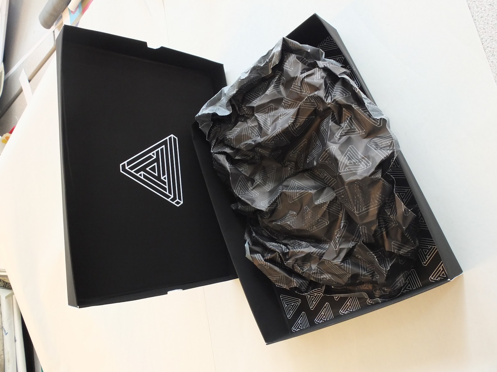
Below is an image of what the box looks like within the bag. The fit is quite snug, but due to the large nature of Samantha's garments and the printing restrictions I was faced with I could only do my best.

Final Product Shots
Today I managed to complete my fashion branding brief. It was a real struggle to work to my schedule when Samantha had been given an extension. She was working towards dates that meant I had very little time to bring together resolutions and have them printed on the right stock and to the right format.
Below is a shot of the business cards. Having designed the logo quite a while ago this was a part of her stationery that I was able to stay on stop of. It took a lot for me to receive her approval. Let's just say she wasn't scared to make her opinions known. I advised that a triangular business card was perhaps not the best option, but she insisted. Nevertheless I am pleased with results, and think this unique approach sets her apart from the rest of her graduating year. Something she wanted more than anything.

Another deliverable I was able to complete today was the triangular look book. After being given the images only a few days ago, I was left just a few days to develop a design that was both practical and satisfied her quirky requirements. The book itself was printed in three X3 sections, resulting in a 46 page publication, with additional front and reverse covers. I bound the publication with a coptic stitch, and then covered the seam with a strip of black cotton Samantha had used in her collection.
Below are a few product shots that show the book layout in action. It took a while to figure out how the images and text would be printed correctly, but I was incredibly proud when it all came together with no complications.


Below is a shot of the business cards. Having designed the logo quite a while ago this was a part of her stationery that I was able to stay on stop of. It took a lot for me to receive her approval. Let's just say she wasn't scared to make her opinions known. I advised that a triangular business card was perhaps not the best option, but she insisted. Nevertheless I am pleased with results, and think this unique approach sets her apart from the rest of her graduating year. Something she wanted more than anything.

Another deliverable I was able to complete today was the triangular look book. After being given the images only a few days ago, I was left just a few days to develop a design that was both practical and satisfied her quirky requirements. The book itself was printed in three X3 sections, resulting in a 46 page publication, with additional front and reverse covers. I bound the publication with a coptic stitch, and then covered the seam with a strip of black cotton Samantha had used in her collection.
Below are a few product shots that show the book layout in action. It took a while to figure out how the images and text would be printed correctly, but I was incredibly proud when it all came together with no complications.


Friday, 25 May 2012


Thursday, 24 May 2012
Final Sin Inspired Patterns
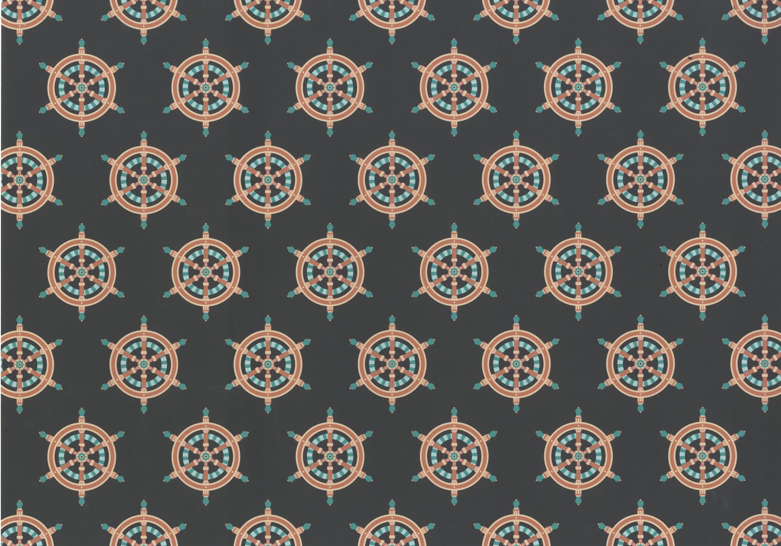
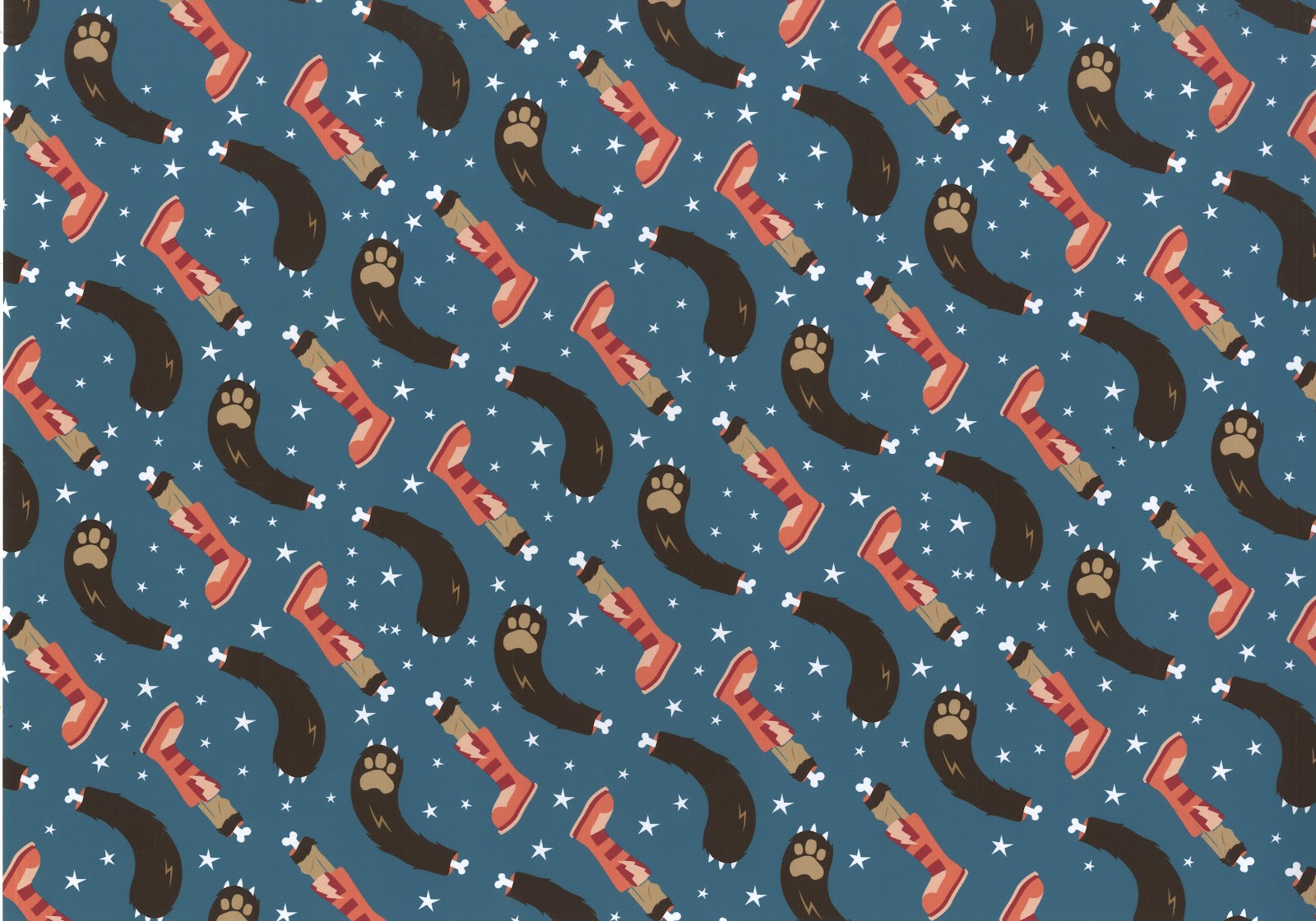
Below are the final seven patterns I have generated for this brief. Each one takes the 'punishment in hell' for the seven sins, and the animal that represents it, and interprets it in my own way. The list goes as follows from top to bottom:
Broken on the wheel (Pride)
Snake frozen in water (Envy)
Toad boiled alive in oil (Greed)
Smothered in fire and brimstone (Lust)
Dismembered alive (Wrath)
Snail thrown in snake pit (Sloth)
Force fed snakes (Gluttony)
I'm incredibly happy with the results, and think the patterns work really well both together and individually. I am also very pleased with the colour combinations I was able to come up with.




Broken on the wheel (Pride)
Snake frozen in water (Envy)
Toad boiled alive in oil (Greed)
Smothered in fire and brimstone (Lust)
Dismembered alive (Wrath)
Snail thrown in snake pit (Sloth)
Force fed snakes (Gluttony)
I'm incredibly happy with the results, and think the patterns work really well both together and individually. I am also very pleased with the colour combinations I was able to come up with.




Assembled Swing Tags
Another day, another assmebled resolution to my fashion branding brief. Today I was able to print and assemble the swing tags for the 'Tryptik' collection. I was incredibly pleased with the results. I think the reason for my satisfaction with the swing tags is how nicely all the different elements came together.
The tags themselves are composed of three different elements. Firstly is a 40mm wide piece of mirror with the tryptik triangle ecthed onto one side. Next is piece of tracing with the triangle printed on in black ink, laid over the greyscale diamond patter. On the reverse of this pattern is all the necessary information for the individual garments. These two stocks are held together with a stainless steel 5mm eyelet.
The last component of the swing tags is another triangle, this time printed using the single silver sided stock. On the white side is the inspiration behind the collection. This tag is finished off with a 5mm matte black eyelet, chosen to contrast the silver stock. All the different elements are brought together with a 3mm stainless steel chain measuring roughly 200mm, allowing a 100mm drop length.
I think the tags work really well because of the many different ways the logo is featured; printed on different stock in different colours, and even etched into mirror. Samantha was incredibly pleased, and so was I!


The tags themselves are composed of three different elements. Firstly is a 40mm wide piece of mirror with the tryptik triangle ecthed onto one side. Next is piece of tracing with the triangle printed on in black ink, laid over the greyscale diamond patter. On the reverse of this pattern is all the necessary information for the individual garments. These two stocks are held together with a stainless steel 5mm eyelet.
The last component of the swing tags is another triangle, this time printed using the single silver sided stock. On the white side is the inspiration behind the collection. This tag is finished off with a 5mm matte black eyelet, chosen to contrast the silver stock. All the different elements are brought together with a 3mm stainless steel chain measuring roughly 200mm, allowing a 100mm drop length.
I think the tags work really well because of the many different ways the logo is featured; printed on different stock in different colours, and even etched into mirror. Samantha was incredibly pleased, and so was I!


Wednesday, 23 May 2012


Look Book Double Page Spreads
After getting the go ahead from Samantha I was able to press forward with the look book layout.She approved of an image being used on the right hand side page, and all the corresponding information on the left. She also liked the fact that I used the diagonal spine of the book as alignment for the text. This was something I then went on further to explore, before ultimately settling on the designs seen below. Also below you an see how I dealt with laying out the text heavy pages, and how I incorporated the greyscale pattern I designed.
She wanted a way of using the logo on each page and if possible having page numbers. So I settled on the approach shown below on the artwork. It's a reflection of the way the pages themselves are laid out.


She wanted a way of using the logo on each page and if possible having page numbers. So I settled on the approach shown below on the artwork. It's a reflection of the way the pages themselves are laid out.
Tuesday, 22 May 2012
Look Book Development
Today I started working on the layout for the look book. I knew I'd be working with a triangle so I wanted to get on with it, and establish any potential issues early on. Luckily I wasn't faced with that many issues, I was even pleasently surprised with the range of layouts I was able to generate for such awkward dimensions. Below are a few screens shots and flip books showing how I got from one stage at the beginning to ideas that I intend to take further once I have Samantha's approval.


Subscribe to:
Posts (Atom)